




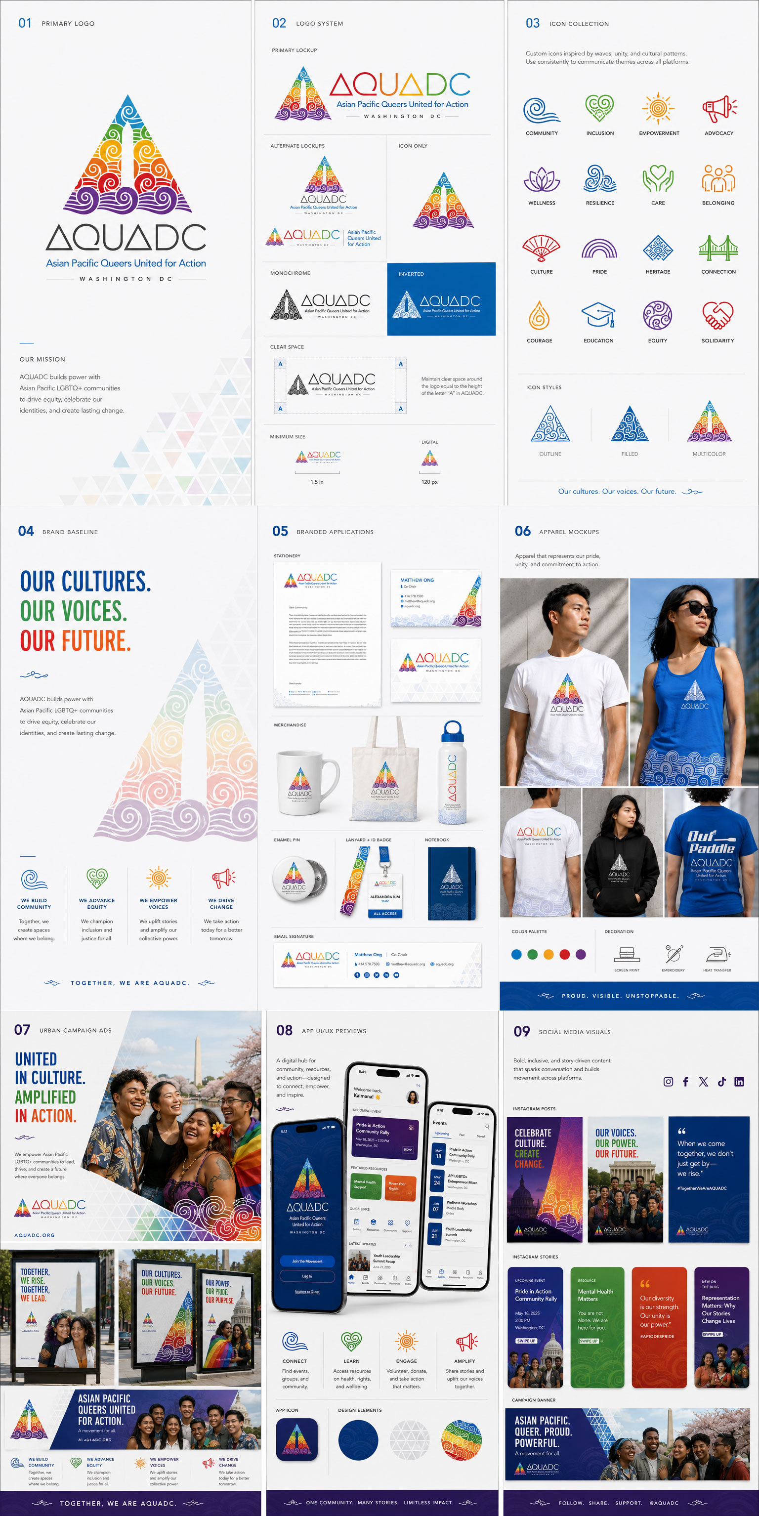
A visual language built for a movement.
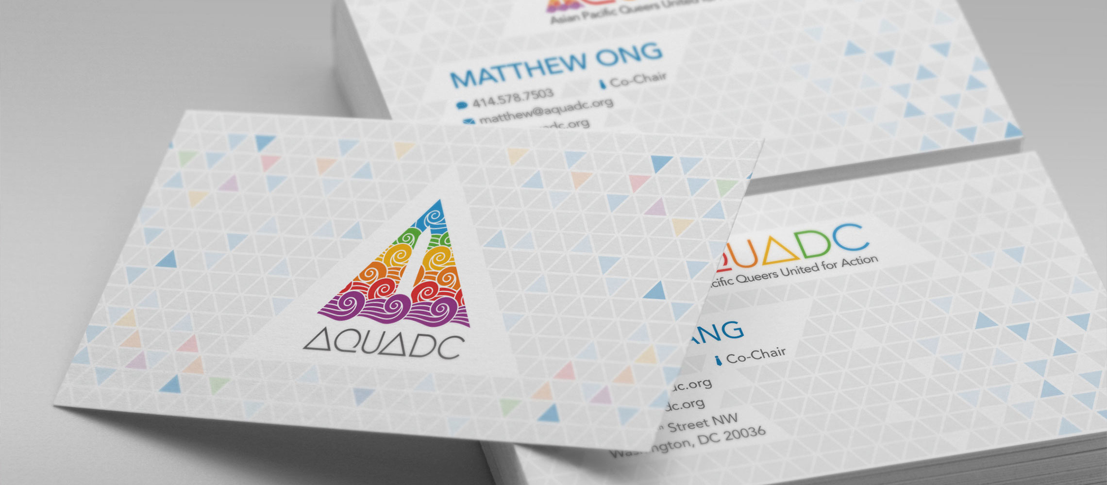
AQUADC had outgrown its visual identity — a community working at national scale, without a language to match. In 2012, as Managing Co-Chair, I built one from scratch: new mark, color system, type direction, and a full identity architecture applied across print, web, event, and sub-brand surfaces.
The timing coincided with the national movement for marriage equality, and the work became part of that moment.
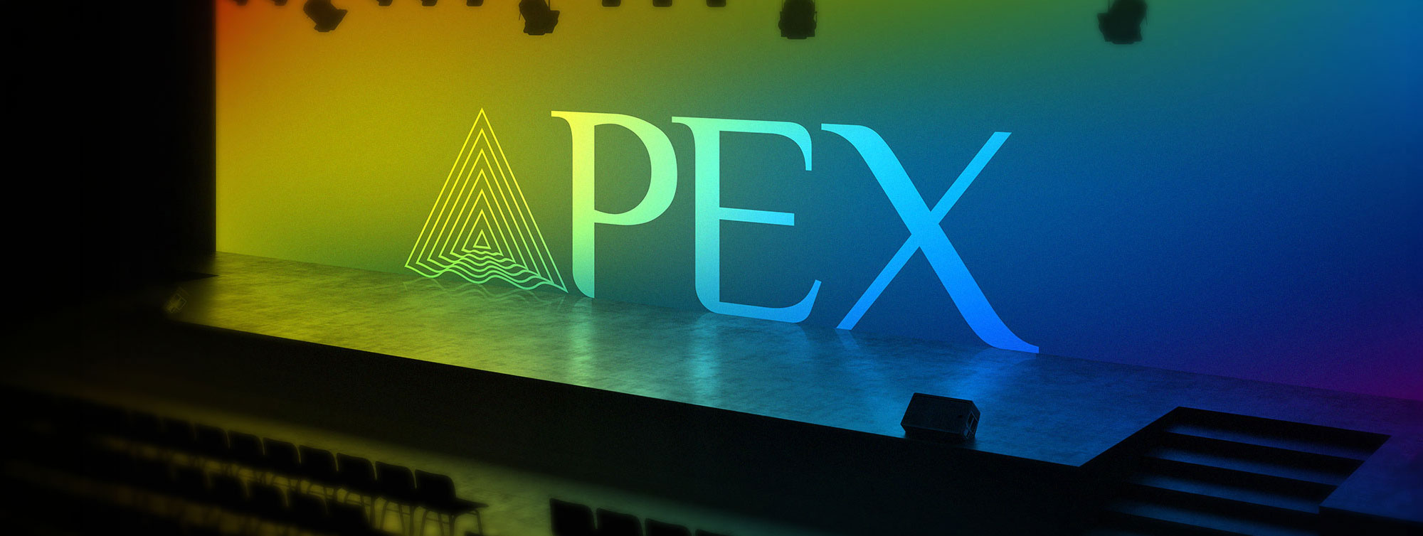
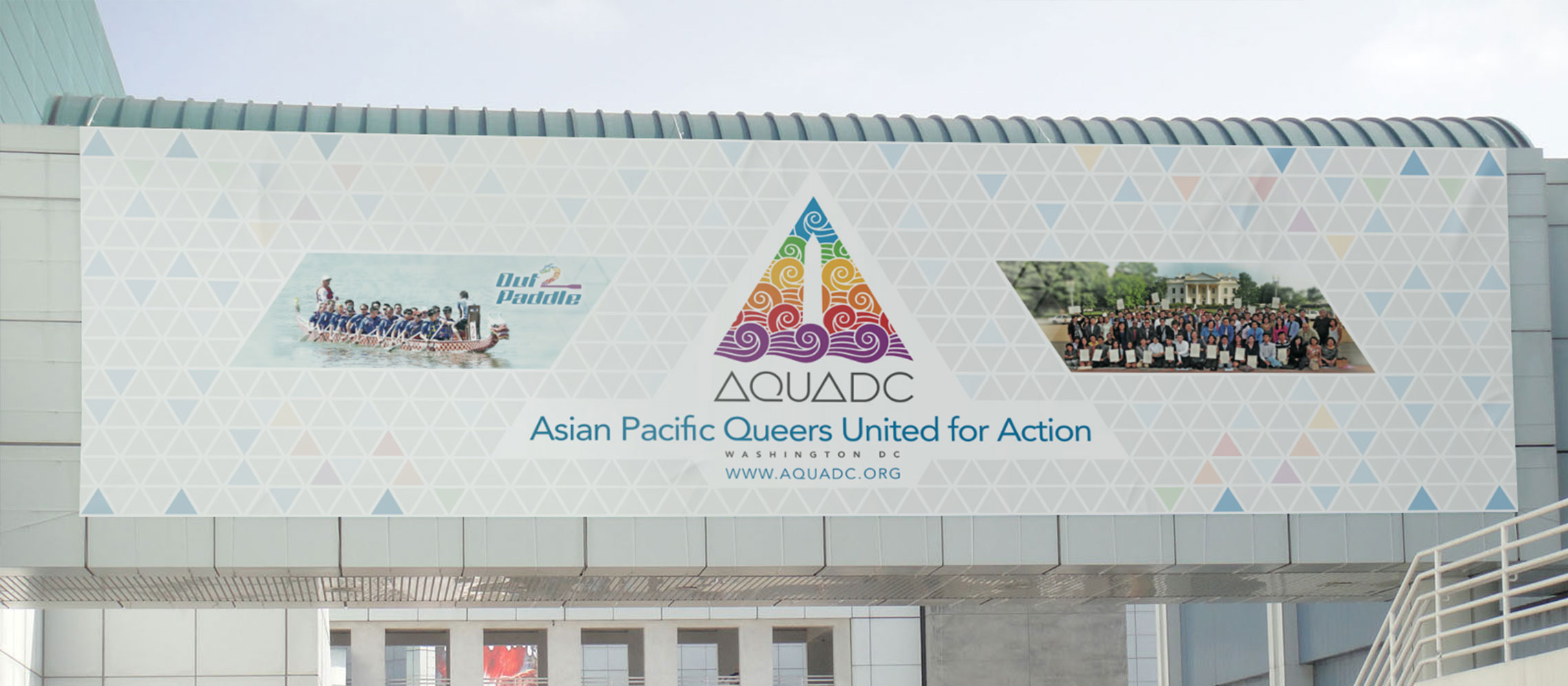
A radiating silhouette capturing the community’s energy and diversity — outward-facing, inclusive, grounded in the visual language of the API queer experience, and legible from button size to banner scale. Its logic extended into sub-brands — Out2Paddle and APEX each found a distinct register, each unmistakably family.
A functional icon set built to extend the brand’s visual vocabulary — geometric, on-system, and legible at small scale across digital and print surfaces.
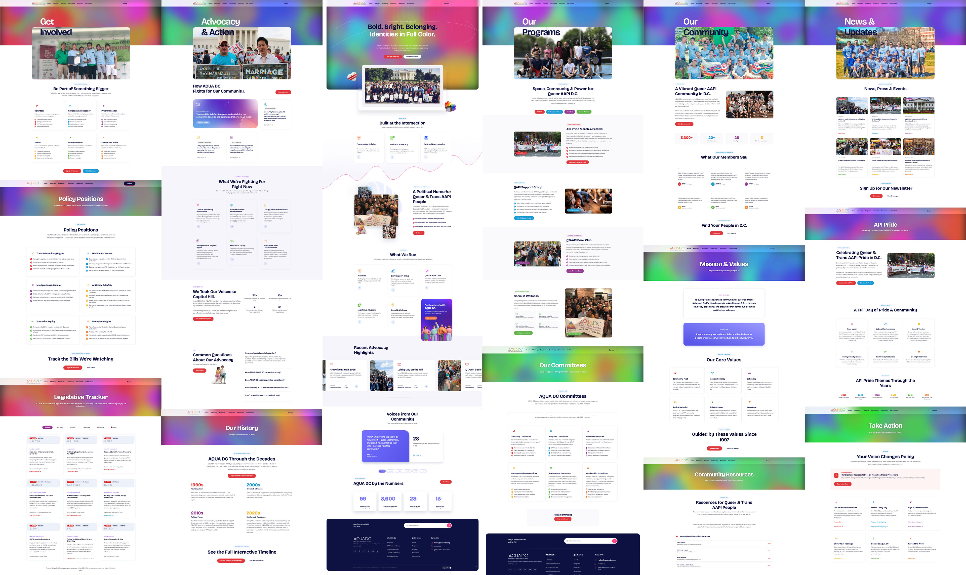
The current AQUADC website is a full-stack front-end build designed to match the scale and ambition of the organization's work. The architecture maps directly to how AQUADC actually operates: advocacy, programs, community resources, and a living history going all the way back to 1997.
Twenty-plus page templates, built mobile-first — an interactive history timeline navigable by decade, a live legislative tracker monitoring federal anti-LGBTQ+ bills, program pages for API Pride and the QAPI Support Group, a testimonials carousel, and a community stats dashboard. The brand's coral, teal, navy, lavender, and gold palette became a full visual language — each section carrying its own color signature while remaining cohesive across the whole.
Built to serve a community — and earn its belonging.
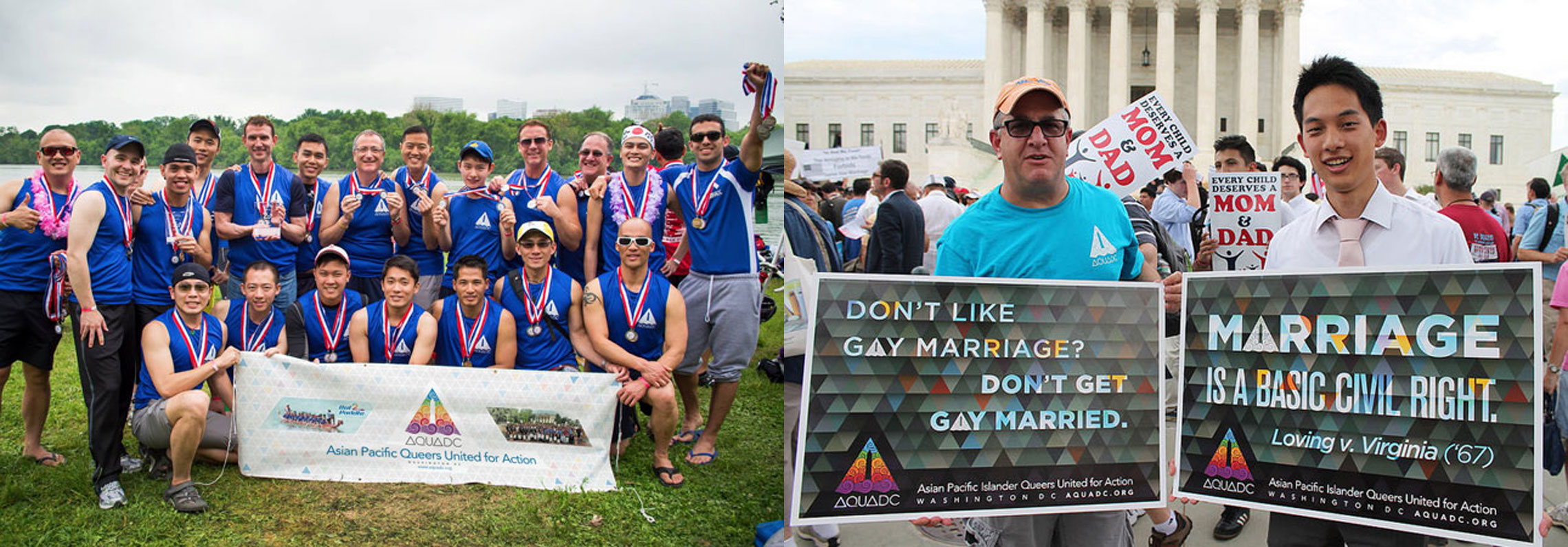
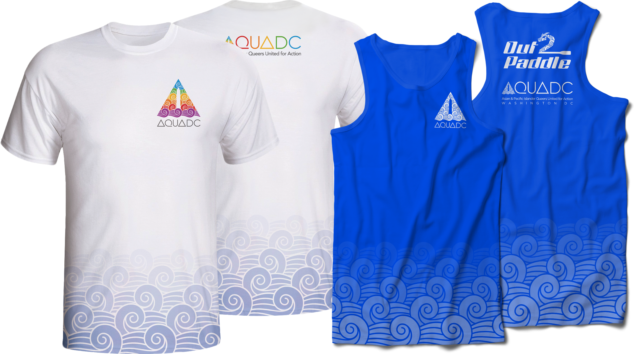
Branding for AQUADC’s dragonboat racing team — extending the parent identity into a more athletic, competitive register. The mark retained the AQUADC DNA while earning its place on the water.
Collateral and signage for marriage equality rallies at the Supreme Court in 2015 — bringing the AQUADC identity into one of the most significant civic moments in recent American history.
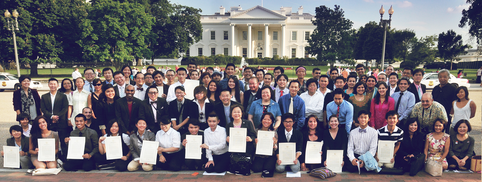
Co-hosting the 2012 NQAPIA national summit in DC, I extended the AQUADC identity into the conference — a new mark that balanced the pinnacle of leadership with the fluidity of personal growth. Digital assets included video panel signage that served as wayfinding for attendees.