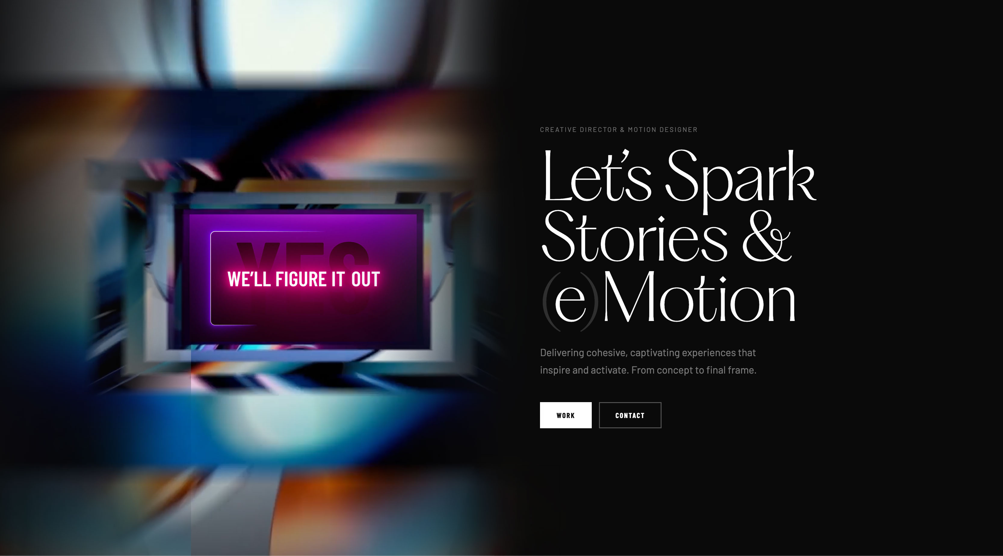





Seven months of rounds for Intel, rebuilt into three surfaces that share one grammar.
Intel and IBM’s pitch ran seven months, across multiple rounds, with finance, supply chain, and talent operations all in scope — inside a partnership now forty-five years deep: Industrial Age, Information Age, and now AI. Every round still lived in a room and a deck, and ended when the room emptied: no way to revisit it, hand it to a colleague who wasn’t there, or pass it to whoever picks up the relationship next. It deserved somewhere to be re-read, shared, and returned to.
I led the three surfaces that carried it forward: narrative, motion system, interaction design, and brand application across Intel and IBM. The film carries the argument with sound; the microsite keeps it open for revisits; watsonx Live, the mobile prototype, puts proof in someone’s hand. The finance argument inside that process walked into its final round already behind, and left having changed the story being told.
The film opens by compressing Intel’s whole pitch into a few seconds of moving type. The two eras Intel already defined, the Industrial Age and the Information Age, share one set of initials: IA. The morph resolves them into the era Intel is pitching now: IA, IA → AI, the Age of Ingenuity: the brand’s own history spelling its future, made in a single transformation of type.
The type morph is the hook. What follows makes the actual case: Intel’s enterprise functions reframed as growth engines instead of cost centers, the bottleneck named in one stat — 38% of finance tasks still sitting in manual, siloed low-cost centers — and the IntelAgentic platform positioned as the fix. The job isn’t to explain the pitch. It’s to earn the room before it starts.
A history that spells its future.
The pitch ends, but the argument doesn’t have to. The IBM × Intel microsite gives the same case — the same chronology, the same four capability domains, the same proof points — a permanent address a partner can share, revisit, and hand to the next person in the room.
Forty-five years of partnership history run through the site: the sub-1nm and High-NA EUV work at Albany gets its own milestone page, the Xeon-on-Cloud story gets another, and a fuller chronology connects them. The opening film embeds inside the capabilities page; named voices and proof points sit a click away. The same typography, color, and eased motion carry from the room to the browser.
An argument worth a revisit.

The microsite keeps the argument alive. watsonx Live pushes further: never deployed, but built with the same rigor as if it had been, so a partner could hold it and try it on a data-center floor, not just watch it in a boardroom.
watsonx Live is built around one argument: speed only matters if you can trust what it produces. Snap an invoice and the fields come back redacted before they ever left the phone. Ask Granite and the answer arrives cited, tied back to the record that produced it. Provision a sandbox and watch exactly where the data does and doesn’t go. The moment that lands hardest is the camera: point it at a chip and verify the hardware yourself — forty-five years of partnership history surfacing as proof. That same standard holds for the prototype itself: every screen, down to the mid-scan animations, is a real, individually linkable state, not a staged sequence of images.
Every wait designed; every transition a small promise about how the production system would behave.
Twenty screens, eleven flows, one phone.
Proof you can tap.
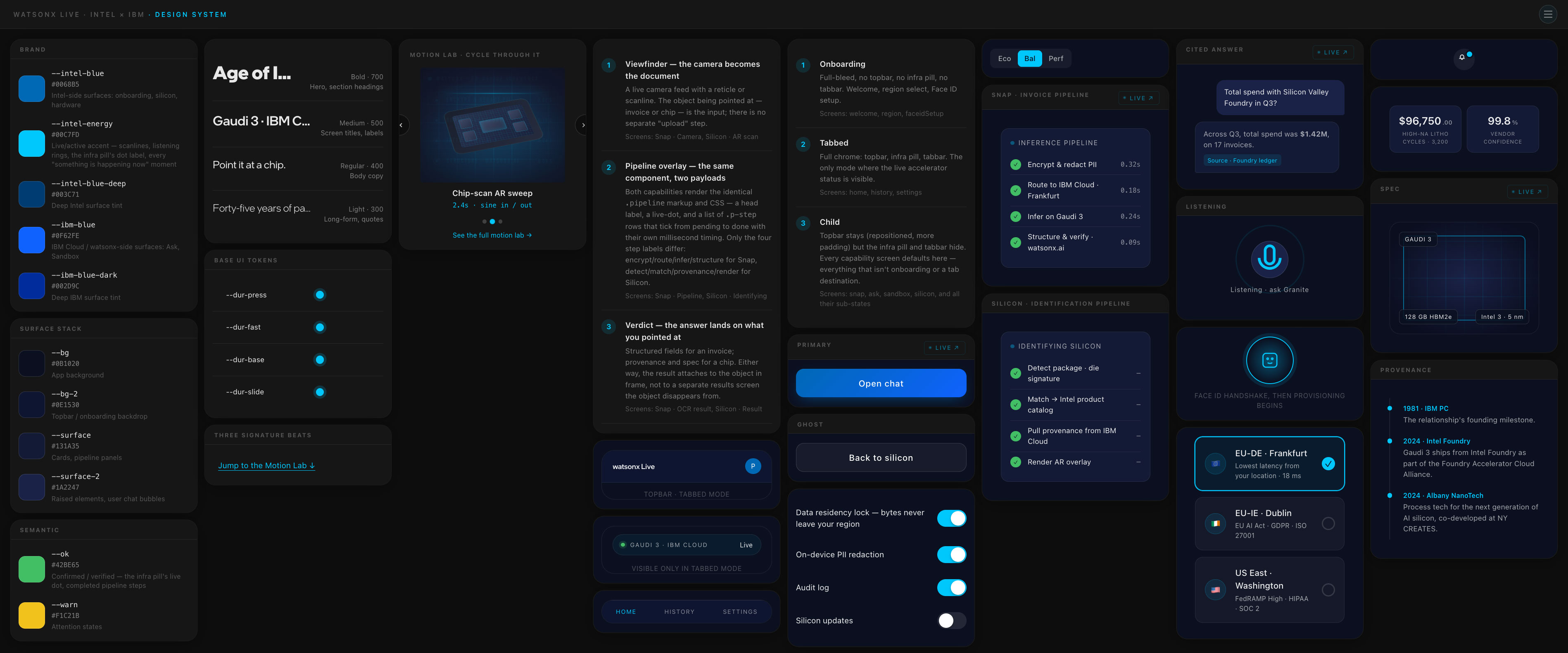
Intel’s engineering precision and IBM’s editorial restraint share one easing family across film, microsite, and phone. The same curve that times the letter morph paces the snap-pipeline cascade, the chip-scan sweep, and the listening rings — three signature beats from a single system, each tuned to its surface. Same restraint at every scale.
You feel the same company made all three before you see a brand mark.

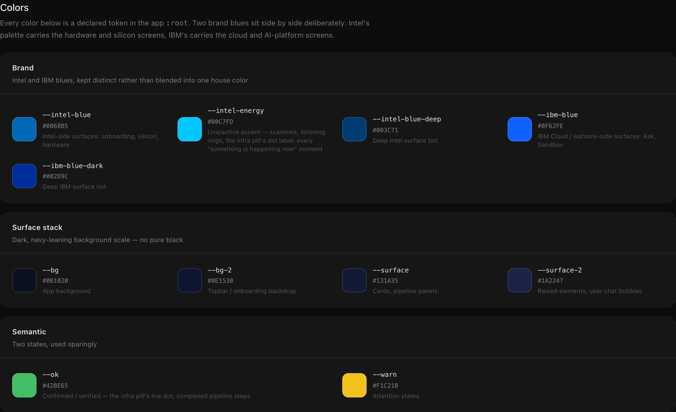
Intel and IBM blues sit side by side as declared tokens, never blended into one house color: Intel’s palette carries the hardware and silicon screens, IBM’s carries the cloud and AI-platform screens. The surface scale beneath them stays navy-leaning end to end, never dropping to pure black, so neither blue has to fight a harsh edge to read clearly.
See the full token setNever one house color.
Both surfaces, microsite and 20-screen mobile prototype, are plain HTML, CSS, and JavaScript. No framework, no build step: every motion choice lives in code a product engineer can open, read, and reuse on day one. Brand-mark lockups, eased transitions, AR scan callouts, the camera-as-document interaction — all expressed as working components, not redlines a team has to reinterpret.
Twenty rendered screens across eleven flows: from onboarding through the camera scans to the sandbox, the live benchmark, and the foundry tour. Each tile opens the rendered screen.
The component library is where that claim gets tested. Tokens and motion timings read straight out of the running app’s own code, not redrawn for presentation. The strongest proof is Camera as Document: the pattern got its name only after Snap and Silicon had already converged on the same four-step pipeline component on their own.
The prototype is the spec.

A folder of source articles became a forty-five-year partnership chronology. I gathered the corpus; Claude surfaced the patterns across it and proposed the order — and that sequence became the spine of the microsite. The same brief-and-review loop ran on the motion: the signature beats were re-timed across repeated passes, each one cutting the choreography closer to the version that shipped.
The pitch pulled together bios, decks, and demos from a team spread across five countries. Every piece had to read as one voice by the time it reached the room. I built the shared template the team’s materials moved through round after round, then worked the final changes myself with the people about to present to the client’s finance leadership.
Narrowed until nothing else fit.
Whoever picks up this relationship next won’t start from a deck.
They’ll start from all three of these.