Field Guide Design System
Documents the real tokens, screens, and motion system inside the 23-screen Design Thinking Field Guide built for the IBM × Mondelēz partnership. The Field Guide app is speculative and never deployed; the workshop it digitizes was real. All values below are read directly from app/index.html, not reconstructed from memory and not sourced from David's separate davrlee.com case-study write-up — click "Live ↗" on any block to open the real screen.
All declared tokens in the app :root. --ink is the light background the whole app runs on — the Motion Lab section below runs on this same light palette. The seven brand hues below are named and valued after Mondelēz's real seven-tone campaign palette (David's own 2017 IBM × Mondelēz "Joy" campaign work), not an approximation invented for this prototype — realigned 2026-07-17 after the earlier fictional-hue drift was caught.
--mdlz-orange, --mdlz-navy, --mdlz-lime, etc.) rather than sourcing them exactly — #f15822 where the real Juicy Orange is #e63a00, #214099 where the real Bold Blue is #162495, #287819 in the app/library and an independently-drifted #b9c433 on the microsite where the real Zesty Green is #aaba00 (neither surface had it), #ce2028 where Delicious Red is #ce1126, #fbd116 where Toasty Yellow is #f6c900, #06b6c5 where Minty Teal is #36aaba. Only Mondelēz Purple (#4f2170) was already exact. Values corrected first, then every token renamed to carry its real campaign name directly (--mdlz-orange → --mdlz-juicy-orange, and so on) rather than leaving the real name as a separate label alongside a generic identifier. Real names and values sourced from David's own real 2017 IBM × Mondelēz "Joy" campaign portfolio page, which lists all seven tones. The app/microsite lime divergence flagged in this doc's rule 42 write-up is now moot — both surfaces draw the identical, correct Zesty Green. Persona identity colors (Rajiv, Smita) were hardcoded hex duplicates of the old drifted values and are now corrected and renamed to match. Motion Lab below reuses these same light app tokens for its chrome (re-themed 2026-07-16 — it originally carried the case-study website's own dark --black/--amber palette). The Motion Lab's own scoped curve-color set — --mdlz-c-delicious-red, --mdlz-c-toasty-yellow, --mdlz-c-juicy-orange, --mdlz-c-zesty-green, --mdlz-c-minty-teal, --mdlz-c-bold-blue (declared on #motion-lab specifically, kept as its own scoped set per this section's earlier real-vs-case-study-palette note) — now carries the same corrected values and names.Three faces, one job each — never mixed within the same line. Verified against app/index.html's own font-face declarations and base styles.
Three named curves carry the entire app — comment in app/index.html is literally the spec. --gentle-out for state changes, --tap-spring for taps and arrivals, --arrival-glide for first-paint choreography.
--dur-fast 180ms (hover, toggle, chip) · --dur-base 300ms (cards, panels) · --dur-slow 480ms (sheets, overlays, full-screen). Click any row to replay.Three named curves from the Field Guide app — tap any moment to compare them. The matrix placement springs (520ms tap-spring, verified against app/index.html's .fg-snap-in), the AI wait state sweeps at a steady pace (1.4s, verified against .fg-scan-sweep), and returned suggestions glide into place (620ms arrival-glide + 90ms/chip stagger, verified against the app's own JS comment). The comparison/readout UI was built by porting working demo code from David's own davrlee.com case-study write-up; the curves and durations it demonstrates are independently real in the app itself, cited above.
Three curves, one system.
Tap any moment to compare the three behaviors. The matrix placement springs, the AI wait state moves at a steady pace, and returned suggestions glide into place. All three appear on the same axis below.
Snap into quadrant
Tap an opportunity, then choose a quadrant. The dot lands with a small overshoot and settles; the receiving zone glows once to confirm the placement.
Open Rajiv's matrixAI wait sweep
When the prototype asks watsonx for help, the response takes a couple of seconds. A diagonal light bar crosses the tray at a steady pace, making the active request visible until the suggestions return.
Public demo presents the motion with AI disconnectedFly to quadrant
Returned suggestions move into their quadrants 90 milliseconds apart. The stagger gives the group time to follow each placement; the final quadrant pulses once to close the sequence.
Open Nirmal's matrixPersistent 56px header in the brand purple. Back button and trailing action fade in only on screens that need them (session tabs, sheets) — hidden (not removed) elsewhere so the header height never shifts.
Persistent 56px header (real element: <header id="app-header">), always full width of whatever screen it sits in — no width of its own in the real CSS, shown here exactly as coded with no cap. The trailing action button was previously drawn as a kebab/more-options icon here — fabricated; the real icon is a three-node share glyph, corrected below.
Every "add" action across Empathy, Journey, and Brand Reference reuses one bottom-sheet component — a single input pattern rather than a bespoke modal per screen.
One input pattern reused for every "add" action across Empathy, Journey, and Brand Reference — a single textarea, cancel/submit pair, and a dimmed scrim behind it. openSheet(ctx, key, title, placeholder, color) sets title/placeholder/accent per call site; shown here as opened from the Empathy "Says" quadrant. Placeholder and submit-button accent were previously wrong here — corrected below (real placeholder is quadrant-specific coaching copy, not a generic one; real accent is the quadrant's own teal, not a flat purple default).
value='') and gets no readonly attribute, corrected below. No width cap applied.Three practitioners, three colors, one card shape. Each persona's brand color (--pc) recolors the same radial-gradient card treatment — content changes by practitioner, the interaction model stays consistent.
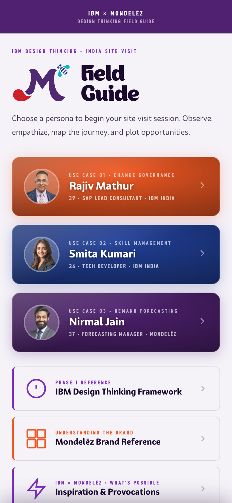
The three real entry points on Home — a persona-colored radial-gradient card, generated by renderHome() from the PERSONAS array. Markup and text below are copied verbatim from that render function's template string, including the real avatar images (previously rendered here as text initials — a fabrication now corrected) and the full three-part role line (age · role · org — previously missing the age).
fg-rise on first paint — fast enough to read as one gesture, slow enough to feel choreographed rather than random (comment verbatim from app/index.html). No width cap applied — .persona-card is width:100% in the real CSS with no cap of its own; shown here exactly as coded.A stack of four entry points into the non-session content — framework reference, brand, inspiration, and synthesis — kept visually secondary to the persona cards so the primary task (pick a session) isn't competing with reference material. The synthesis card is conditionally hidden until ≥2 personas have matrix data; shown here in its visible state with a live sub-count.
All four real entry points — same glass-card treatment as the proof stack (rgba(245,242,248,.22) + backdrop-filter:blur(6px)), each recolored by its own accent and icon. The fourth (Compare Patterns) is conditionally rendered — only visible once ≥2 personas have matrix data — shown here in its visible state with a live sub-count.
app/index.html — no width of its own, fills whatever container it's given. No wrapper or cap added here.First tab of every session, decomposed into its two actual reusable components — Persona Header and Info Card — rather than documented as one intact "Bio tab." Real content from all three personas, extracted from the phone frame so the cards read at their own natural scale.
Opens every session tab — avatar initials, use-case label, name, role, and a verbatim quote from the 2019 workbook. Background is a radial gradient of the persona's own --pc; no phone chrome required to read correctly.
PERSONAS[n].quote verbatim from app/index.html, not paraphrased.The same labeled card repeats three times per persona — Goal (a single paragraph) plus Motivations and Pain Points (tag chips + a bulleted list). Border-left color always matches the active persona's --pc.
To be recognized as the best in his peer group
To grow professionally at the beginning stages of her career
To ensure tasks under his responsibility are successfully completed
- Achieve promotion in a year's time
- Spend more time with family
- Scope is never defined — work is so stressful
- Too many mails
Classic four-quadrant empathy map, decomposed into its one real component — the Empathy Quadrant — shown across its four color variants plus proof that quote content, not color, is what changes per persona.
One repeated card — primary label, secondary sub-label, an add button, and a short list of captured quotes. Color is fixed by quadrant type (QUADS_EMP in app/index.html) — teal/Says, purple/Thinks, orange/Does, red/Feels — never by persona.
Session journey, decomposed into its four real components — Stage Card, Thought Chip, Feeling Row, Opportunity Badge — each proven across all three personas rather than shown once as an intact "Journey tab." Step count itself varies per persona (five for Rajiv, four for Smita and Nirmal); the card shape doesn't.
Opens every stage — a numbered badge in the persona's --pc color, the stage name, and a "Doing" field underneath. Step count and every stage name come from that persona's own stages[] array, not a fixed five-step template.
opp field in the real data, so his instance shows stage 2 — the first with real Opportunity content — rather than forcing an empty field for cosmetic consistency.A running numbered list under "Thinking" — pre-seeded thoughts (.pre, italic, non-deletable) followed by anything the user adds live (solid, deletable). All three instances shown are the real pre-seeded pair for that persona's stage.
app/index.html.Two rows, Pos and Neg — each stage pairs a positive and a negative feeling word, never collapsed to one sentiment. The words themselves are per-stage, per-persona real data, not a fixed pos/neg pair reused everywhere.
The IBM answer for this specific stage — a small tinted badge (persona --pc at 12% opacity) plus the opportunity text itself, grounded in that stage's real friction rather than floating free of context.
Decomposed into its three real components — Quadrant Grid, Unplaced Tray, AI Suggestion Card — each proven across personas rather than shown once as an intact "Matrix tab."
A real 2×2 opportunity matrix — Big Bets / No Brainers / Utilities / Unwise — with axis labels for Impact (y) and Feasibility (x). Placed items are colored dots in the persona's --pc. Fill pattern varies honestly: Nirmal's grid has two empty quadrants where Rajiv's and Smita's have none.
opp field in app/index.html) — a smaller real pool than Rajiv's or Smita's, shown as-is rather than padded out.Opportunity fragments not yet dragged into a quadrant sit here as chips. A chip mid-drag (or just selected) gets the persona's --pc as a solid fill; everything else stays neutral.
Triggered by "AI Suggest Placement" — proposes a quadrant for each unplaced tray item using demo-mode fallback logic (QUADS_FALLBACK = ['bigBets','noBrainers','utilities','unwise'], cycled by item index — this prototype has no live backend, so this fallback is what actually runs). "Accept all" is the real trigger for the Motion Lab's "Fly to quadrant" demo.
Recap of the whole session, decomposed into its own real components — Collapsible Section and Summary Matrix Grid — closing with a single Share action. The header at the top of this screen reuses the Bio section's Persona Header component verbatim (see Bio above) rather than being a distinct component in its own right.
Three of these stack under the persona header — Empathy Map, As-Is Journey, Impact/Feasibility Matrix — each with a colored title (teal / persona --pc / orange) and a chevron toggle. Content is a short recap, not the full section: Empathy Map shows only Says + Feels, Journey shows only the first stage.
A compact, read-only restatement of the Matrix section's Quadrant Grid — same four labels, same real placements, but as static dots with no drag affordance since the session is being reviewed, not edited.
.tray-empty rule; the real value was accurate, only the styling was gone.Single full-width button closing the screen, themed to the active persona's --pc.
--pc #e63a00 (Rajiv), #162495 (Smita), #4f2170 (Nirmal) — same three values used throughout this library.The framework explainer reached from the Home screen's reference card — the design-thinking loop, the three key capabilities, and the guiding principles, stated once rather than repeated per persona.
The real Reference screen's two sub-sections: The Keys — three real IBM Design Thinking terms (Hills, Playbacks, Sponsor Users), each with a real SVG shape icon, not the emoji/generic-process labels previously shown here — and The Guiding Principles — three real principle cards, not one invented summary card. .fg-tab is the real reusable tab-content wrapper class — not phone-specific chrome — so it reads directly at whatever width it's given.
rgba(245,242,248,.22) + backdrop-filter:blur(4px)) as the Home Reference and proof-stack cards elsewhere in this library — one visual language for "reference" content across the whole app. Real background behind these cards is --ink, identical to the demo panel's own default — shown here on white instead, purely a documentation-contrast choice (the glass tint reads as off-white against it), not a change to the real card CSS. Not shown here but real and unaudited: the screen also has a third sub-section, "The Loop" (Observe → Reflect → Make), missing from this library entirely — flagged, not yet added.A quick-glance reference for Mondelēz product cards, IBM service commitments, and the shared color palette — context tooling, not session content.
The real component isn't a standalone list of snack cards — it's a two-column paired grid, .cat-commit-grid, matching each of the 7 real SNACK_CATS product categories against its positionally-paired COMMITMENTS entry: "Mondelēz Products" on the left, "IBM Commitments" on the right, both real column labels. .snack-grid (a single-column list) is real, declared CSS — but it's never actually used anywhere in the app; the live screen renders through .cat-commit-grid instead. Three of the seven real pairs shown below.
.fg-tab reusable wrapper as the Framework Keys sheet — not phone-specific chrome, reads directly at whatever width it's given. List view runs the real, unscaled CSS — this screen already runs at native app scale there, nothing reduced. .snack-card is a solid --pc gradient with white text/icon; .commit-card is a light 12% tint of the same pillar's color with a matching-tint border and its icon in original (not inverted) color — genuinely different treatments for "what Mondelēz has" vs. "what IBM is committing," not a styling inconsistency. Grid view condenses this pair: real icons are 40px with a real single-line, ellipsis-truncating brand line — at true grid-tile width that combination clips mid-word, so grid view shrinks the icon to 22px and lets the brand line wrap instead of truncating. No cropped text in either view; list view still shows the real nowrap+ellipsis behavior at the width it was designed for. Color stripe below is all 7 real SNACK_CATS colors in source order.


Four AI-era provocation cards, each pairing a challenge with an IBM proposition — the case for the partnership, made scannable in a single reusable card shape.
One of four real PROVOCATIONS entries — a gradient headline zone pairing a consumer-joy provocation with an IBM proposition beneath it, plus a share button and a "Learn more" chip that expands to the full detail paragraph. Previously entirely fabricated here (a "demand forecasting"/watsonx-anomaly-detection card that doesn't exist anywhere in PROVOCATIONS) — replaced with the real first entry, the Oreo/Joy provocation.
.fg-tab wrapper, same reusable class as the Framework Keys and Snack Cards sheets — not phone-specific chrome. Button text corrected from invented "Expand ↓" to the real "Learn more ↓". .prov-card has no width of its own in the real CSS (fills whatever phone-width container it's in) — capped to 400px here rather than stretched across the full two-column area, the same treatment as Session Header/Bottom Sheet above.Once two or more sessions have matrix data, Synthesis overlays them — consensus and divergence across practitioners, not just one person's opportunity map.
Each chip is a persona's real avatar and first name, colored by their own --pc. All three personas have real placed matrix data elsewhere in this library (Bio, Journey, Matrix & AI Suggestions all document Nirmal's own real data), so all three are shown active here — Synthesis does support a dimmed "no data" chip state for a persona with nothing placed yet, but using it here would contradict every other section of this same document.
state.sessions[pid].matrix — not shown here since it doesn't apply to any of the three real personas this library documents.


Collapsible section matching overlapping opportunity labels across personas by exact normalized text. Shown here in its real, true default empty state — Rajiv's and Smita's pre-seeded opp text pools never share a matching label, so a populated Consensus card between them can't be built from real data without fabricating a label collision that doesn't exist.
synth.divergent.length === 0, genuinely the case here. Its markup/CSS (.divergent-card, .div-label, .div-persona-row, .div-mini-pill) is defined in this library's stylesheet for when real cross-persona divergence exists to document.Complete more persona sessions to find patterns.
A four-cell count of every placed opportunity across all three personas, by quadrant. Real cell order is No Brainers, Big Bets, Utilities, Unwise — not alphabetical, not visual-weight order.
Every placed opportunity from all three personas, overlaid on one 2×2 grid — Rajiv (orange), Smita (blue), Nirmal (purple), no invented text, no invented cross-persona match. An empty quadrant states "Empty" explicitly (real inline-styled span, not this library's .tray-empty class).
Tap any dot to see which persona placed it
Closes the Synthesis screen — a distinct real button from Summary's own "Share Session Summary" action (different text, different export payload: this one exports cross-persona consensus/divergent findings, not a single session recap).
Components unique to ibm-mondelez/index.html ("Partnership Pantry," the pitch microsite) and its companion page field-guide-map.html. Both surfaces share the app's own palette and font stack almost entirely — --ink, --fg, --mdlz-purple, and BW Surco/Appetite/MDLZBiteType all match token-for-token — but one real divergence exists: the microsite's own --mdlz-zesty-green is #aaba00 (visible on the pillar diagram's fourth button below), while this library's app-derived --mdlz-zesty-green token — and the real app/index.html it's copied from — is #aaba00. Two different greens sharing one token name across the two surfaces, not a shared design decision; blocks below that use the microsite's real lime cite the hex directly rather than the app's --mdlz-zesty-green variable. Separately: the Motion Lab section above built its comparison/readout UI by porting working demo code from work/mondelez.html, David's own portfolio case-study write-up — but the three curves it demonstrates are independently verified against app/index.html itself (see the section's own note), so it's cited to the app now, not the case-study page. It's a distinct citation from the microsite sections below, even where both happen to cover the same subject (the AD Factory motion language).
The microsite's full-viewport hero: a looping video background, three slow-drifting blurred color orbs, a gradient-clipped display headline, and a canvas-drawn field of brand-category glyphs behind it all. None of this exists in the app.
The hero headline "Made for every moment." sets in Appetite at a viewport-scaled clamp size, with the last word rendered as a gradient-clipped span rather than a flat color — purple bleeding into navy. Behind it, three separately-timed blurred radial gradients drift on independent multi-second loops, so the hero's background motion never quite repeats.
.hero-h1 — font 'Appetite','BWSURCO', font-size:clamp(52px,7.5vw,108px), line-height:.88. .hero-h1 .hi — background:linear-gradient(135deg,var(--mdlz-purple) 0%,var(--mdlz-bold-blue) 100%) clipped to text. Three orbs .hb1/.hb2/.hb3, each filter:blur(90px), animate on independent keyframes hbf1 (80s), hbf2 (60s, 12s delay), hbf3 (50s, 6s delay) — translate-only drifts, alternating direction. A .hero-veil linear-gradient fades from solid --ink on the left to transparent at 58%, so the headline stays readable no matter what the video is showing underneath.every
moment.
Behind the orbs, a full-viewport <canvas> procedurally draws a loose grid of eight hand-coded glyphs — candy, a biscuit grid, a beverage carton, a coffee cup, a chocolate bar, a gum pack, a cookie, and the word "JOY" — in the seven brand colors, randomized in position, size, and opacity on every resize. It's a code-drawn pattern, not a background image.
#snack-canvas, opacity:.12, pointer-events:none. drawIcon() switches on 8 cases (0–7) using raw ctx path/arc/rect calls; colors drawn from COLORS = ['#d41f1f','#c89818','#c85818','#68a818','#5e38a0','#009fb8','#1e32a8'] — the same seven hues used as the pillar diagram's per-pillar accent colors below. Grid spacing ~88×78px with per-cell jitter, fully redrawn on every resize event via requestAnimationFrame.Two related stat patterns: a four-cell hover-accent grid directly under the hero, and a numbered, color-bordered card stack that repeats identically (same CSS, different copy) in both the Relationship and Forward sections.
Four real partnership stats sit in a bordered grid directly below the hero. Each cell is inert until hovered — a 2px top bar scales in from the left over 0.4s, the only interaction cue on an otherwise static grid.
#numbers div between Hero and Relationship, background:var(--ink-mid), bordered top and bottom — not part of either section. Real CSS is grid-template-columns:repeat(4,1fr) in one row with generous 44px 36px cell padding; shown here as a 2×2 stack so each cell keeps room to breathe at card width instead of cramming four columns into it — a card-context width adaptation, not a real-value change (the border grid, hover mechanism, and every color/type value below are unchanged). .nb-cell::after — 2px top bar, background:var(--cc,var(--mdlz-purple-hi)), transform:scaleX(0)→scaleX(1) on hover only; nothing is colored until you hover it. .nb-big em — gradient-clipped linear-gradient(150deg, color-mix(cc 70% white) 0%, cc 45%, color-mix(cc 65% black) 100%). Real stats: 14+ years of collaboration (red), 31% delivery cost reduction (orange), 143+ SAP Food & Beverage go-lives (purple), 53+ years of the IBM+SAP alliance (navy) — real DOM order (left to right in the source's single row).The same numbered, left-bordered card sits in two different sections with two different data sets and two different class names — .proof-row in Relationship, .fw-card in Forward — confirming it's a genuine reusable pattern in the source, not a one-off coincidence.
.proof-row / .fw-card — border-left:3px solid var(--cc), glass background:rgba(245,242,248,.22) with backdrop-filter:blur(6px); hover raises background opacity and matches the border to --cc. Title text is gradient-clipped: linear-gradient(to bottom, cc 0%, color-mix(cc 55% black) 100%). Colors cycle orange → lime → teal → IBM blue in both sections. The lime instance here is the real microsite hex #aaba00, cited directly rather than through this library's --mdlz-zesty-green app token (see the divider note above). Real background behind these cards is --ink, same as the demo panel default — shown here on white so the glass tint is visible instead of blending in, a documentation-contrast choice only.Seven commitments IBM organizes the Mondelēz engagement under, shown as a color-coded button row that expands into a two-column detail panel — the microsite's most structurally complex interactive component, with its own auto-advance timer and a play/pause control shaped like a countdown ring.
Each of the seven pillars gets its own radial-gradient button in a distinct color, its own hand-drawn glyph, and its own three-line label — the fourth, "Committing the Proven 'A' Team," is where the microsite's real lime (#aaba00) actually appears in the source, distinct from this library's app-derived --mdlz-zesty-green token. Clicking a button opens the detail panel below without leaving the page; the active button gets a triple-ring outline.
.pillar-btn — background:radial-gradient(ellipse 100% 100% at 50% 28%, color-mix(pc 68% white) 0%, pc 42%, color-mix(pc 52% black) 100%), plus a diagonal sheen (::before) and a thin light ring (::after). .active — box-shadow:0 0 0 3px white, 0 0 0 6px var(--pc), 0 20px 48px color-mix(pc 52% transparent). Icon: .piw > img, a real per-pillar SVG (images/Ensuring Predictable Outcomes.svg, etc.), recolored solid white with filter:brightness(0) invert(1) regardless of its source coloring. Real .pillar-bar is grid-template-columns:repeat(7,1fr), all seven in one row at full viewport width; shown here as a 4-then-3 wrap (repeat(4,1fr), seven items auto-flowing to two rows) so every button stays a legible size at card width — same color, icon, and label values either way. Seven real colors in source order: #ce1126 Predictable Outcomes, #f6c900 Factory Leadership, #e63a00 IBM+SAP Capabilities, #aaba00 the 'A' Team, #4f2170 Culture Change, #36aaba Customized Factory, #162495 Partnership.Live, not staged — this panel is running the real 7-entry DATA array end to end and auto-advancing every 2 seconds, exactly like the source. A giant, faded watermark of the active pillar's own icon slides in behind the left panel on every switch — the same real icon shown solid on the button, reused at 9% opacity as a background texture. Content staggers in element by element (title+stat, then the checklist, item by item), not all at once. Click the corner control to pause — the ring itself is the visible 2-second countdown, frozen mid-arc exactly where you paused it.
index.html's own render()/switchTo()/restartRing()/pauseRing()/startAuto() — same function bodies, scoped to this block's own element IDs instead of the real page's shared pillarBar/pillarPanel. Ring circumference 2π×19 = 119.38, stroke-dashoffset transition 2s linear. Watermark: .pp-icon-wm, real end-state opacity:.09, slides in from the left over 0.8s with a 0.5s delay, resized from the real 630×630px to fit this card. All 7 real pillars cycle, not a fixed subset, and every title/sub/stat/label value is verbatim real copy — the one deliberate trim: the real left panel also carries a full descriptive paragraph (.pp-body) between subtitle and stat, and each checklist normally runs 6 items; both are cut to fit a card this size (3 real items each, paragraph dropped) rather than shown truncated mid-sentence. On load: pillar index 1 (Factory Leadership) opens after a 500ms delay, then auto-advance begins — same real init sequence. Grid view vs. list view render this differently on purpose: grid stacks the stat card above the checklist (two rows) so the icon watermark and content have room to breathe at tile width; list view runs the real 1:2 side-by-side layout at close to real scale (larger type, fuller padding, bigger stat number) since the wider column can actually hold it. Same data, same mechanism, two deliberately different presentations for two deliberately different amounts of space.Five real milestones from 2012 to the 2024–28 active transformation, connected by a line that isn't a static CSS border — it's an SVG path computed at runtime from each element's actual on-screen position.
Each entry pairs a rotated year label with a card; hovering a row scales its dot 1.55× and brightens its year label. The connecting line between entries is rebuilt by JavaScript on load and on resize — it measures the real bounding boxes of the year label and the next dot with getBoundingClientRect() rather than relying on a fixed-position CSS line, so it stays correct if content height ever changes.
buildTimelineSVG() removes any existing .te-trail-svg/.te-trail-seg nodes and rebuilds from scratch each time, using fixed offsets GAP_AFTER:-13, GAP_BEFORE:10. .te-yr uses writing-mode:vertical-rl rotated 180deg with a two-layer text-shadow halo matching the section background, so the vertical numeral doesn't visually collide with the trail running behind it. Five real entries total (2012, 2018, 2017, 2019, 2024–28 — that's the real DOM order, not strictly chronological); two shown below. Previously each card here was missing its real badge and chip row entirely, and both title and body text were heavily shortened without saying so — corrected to the full real strings below.Twenty real IBM case studies, grouped into five named buckets and presented as a filterable card grid — every card links out to a genuine ibm.com/case-studies page.
A horizontal pill row lets a reader jump straight to any of the five buckets — CPG & Consumer Goods Scale, SAP Transformation at Scale, Supply Chain & Traceability, Managed Transition & Continuity, AI & Data in ERP Environments. Each pill carries its bucket's own dot color, and each bucket's own heading in the section below is styled inconsistently in the real source — some gradient-clipped, some flat — reproduced here as documentation, not smoothed over.
.cred-bucket-btn::before — 6×6px dot, background:var(--bc,var(--fg30)); hover swaps the pill to a white background with the bucket's own border color. Buckets 1 (orange), 2 (lime #aaba00), and 4 (teal) get gradient-clipped titles; buckets 3 (purple) and 5 (navy) get flat color — a real inconsistency in index.html, not an error in this recreation.Each of the 20 cards links out to an ibm.com case study — Kraft Heinz, Frito-Lay, AUDI AG, Helvetia, Towngas, and 15 others — chosen because their scope mirrors what Mondelēz needs, not because they document Mondelēz's own work. Card image is a photo (object-fit:cover), not decorative gradient art.
.ref-card-m, documented here under this library's own .ms- prefix convention. Card hover: translateY(-3px) plus a border-color shift to the bucket's accent, image scales 1.04.
A dedicated section inside index.html (#field-guide) that re-presents the app's own 23 real screens as a marketing walkthrough — alternating phone clusters with real screenshots, not recreated mockups. Distinct from the field guide app itself: this is the microsite's own presentation layer wrapping it.
The walkthrough opens with one phone showing the app's real home screen, faded out before its bottom edge by a CSS mask rather than cropped by a hard clip — a preview, not a full device shot. The image is a real screenshot pulled from app/screens/, the same folder the app's own field-guide-map recreation draws from.
.fg-intro-phone-wrap — height:480px, overflow:hidden, mask-image:linear-gradient(180deg,#000 78%,transparent 100%). Image: app/screens/01-home-home-persona-selection.png.the India
experience.
Thirteen rows walk a reader through all 23 real screens two or three at a time, alternating left/right via a .flip class that reorders the grid on desktop, with phones inside each pair or trio staggered vertically so they read as a loose stack rather than a rigid row.
.fg-row.flip .fg-phones{order:2} / .fg-copy{order:1} — desktop-only (min-width:992px). .fg-phones-trio .fg-phone:nth-child(2){transform:translateY(20px)}, :nth-child(3){transform:translateY(40px)} — cascading vertical offsets. Every image is a real captured screenshot, e.g. app/screens/20-mat-matrix-item-selected-placing.png, app/screens/persona-flex/journey-smita.png — not a redrawn mockup.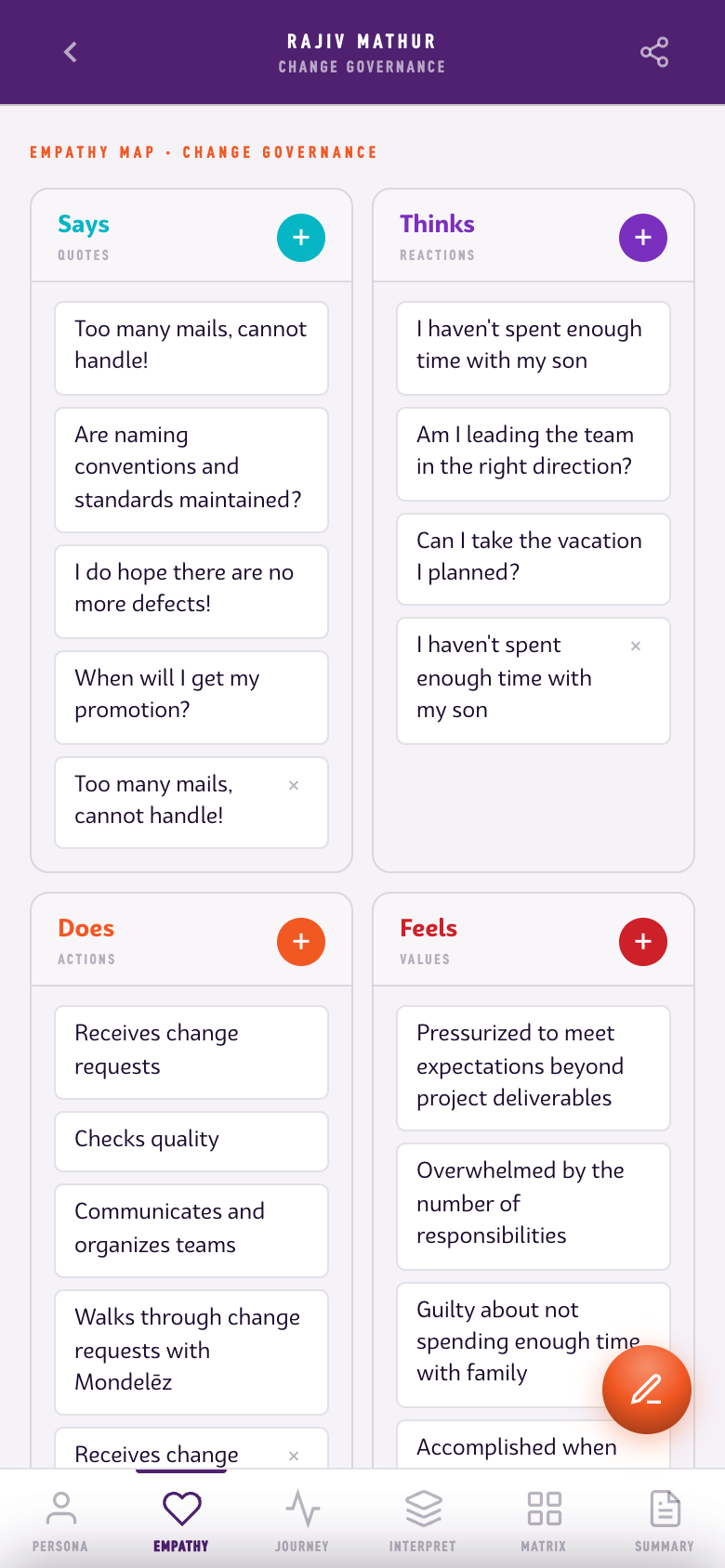
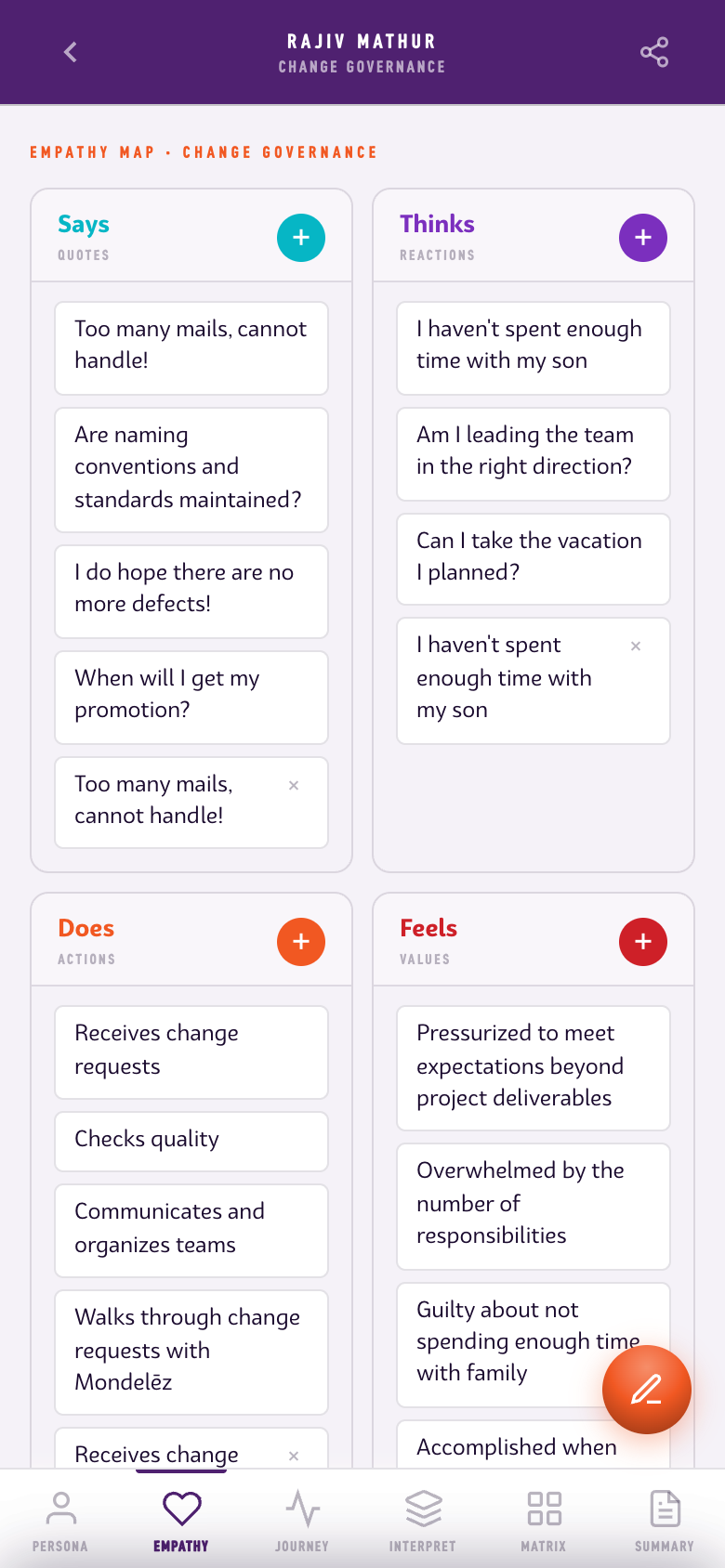
04 · Says · Thinks · Does · Feels — empty grid, full picture. One person's working life, mapped in four quadrants.
The companion page field-guide-map.html — a single-page, data-driven map of every screen and state, where selecting a persona re-renders every downstream section instead of navigating to a new page.
Three persona cards sit at the top of the page; clicking one re-renders bio, empathy map, journey, interpret, matrix, and summary for that person. There's no page navigation and no separate markup per persona — one JavaScript PERSONAS array holds all three people's full session data, and selecting a card just re-runs the same render functions against a different array index.
.pw.ps at rest: opacity:.52; hover: opacity:.82 + translateY(-3px); .active: opacity:1 + ring box-shadow:0 0 0 3px var(--psel), 0 0 0 7px rgba(255,255,255,.08), where --psel is set inline per card to that persona's real color — #e63a00 Rajiv, #162495 Smita, #4f2170 Nirmal — the identical three colors this library's own Bio and Matrix sections already document.Rather than screenshots, every phone on this page is the app's actual markup rebuilt at its native 390×852 size, then optically shrunk with a single CSS transform to fit a 280×612 frame — real components and real classes, just miniaturized, so the map stays a live document of the interface rather than a photo album of it.
.pi{transform:scale(0.7179);transform-origin:top left;width:390px;height:852px;position:absolute;inset:0;overflow:hidden;pointer-events:none} inside a .phone{width:var(--pw)/*280px*/;height:var(--ph)/*612px*/} frame. 0.7179 ≈ 280/390. pointer-events:none on the inner content confirms these are static previews, not live embeds.scaled to 280×612
transform:scale() — no separate mobile stylesheet, no re-authored layout.