



Making the system look as serious as the ideas.
Health policy is made in rooms where credibility is earned before anyone speaks. Founded in 2008 by Robin Strongin, Disruptive Women in Health Care built that credibility fast: national forums and book discussions meant to shake up health policy, not just debate it. Their visual identity hadn’t kept pace. Walk in looking dated, and the argument gets discounted before anyone hears it. The brief was to close that gap.
As Creative Director from 2012–14, I led the complete rebrand — a full brand system, an editorial platform designed and user-tested from the ground up, and motion and campaign work that carried both into those rooms. In 2017, HIMSS acquired the organization.
After the acquisition, I independently created a mobile companion and documented component library imagining how Robin Strongin’s provocative, community-led platform might operate today. The concept is a tribute, not work commissioned by HIMSS or the former organization.
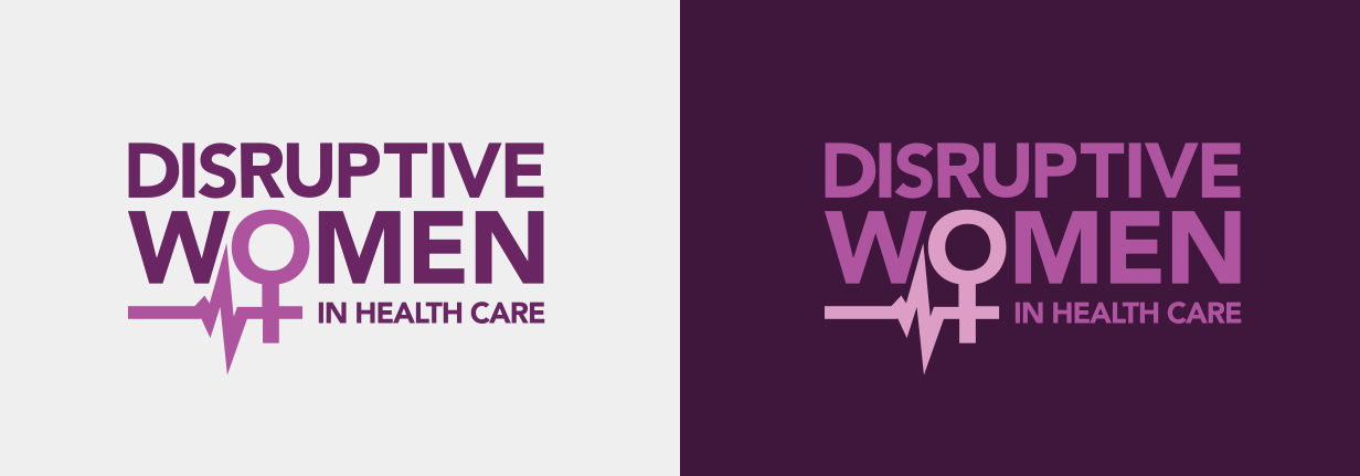
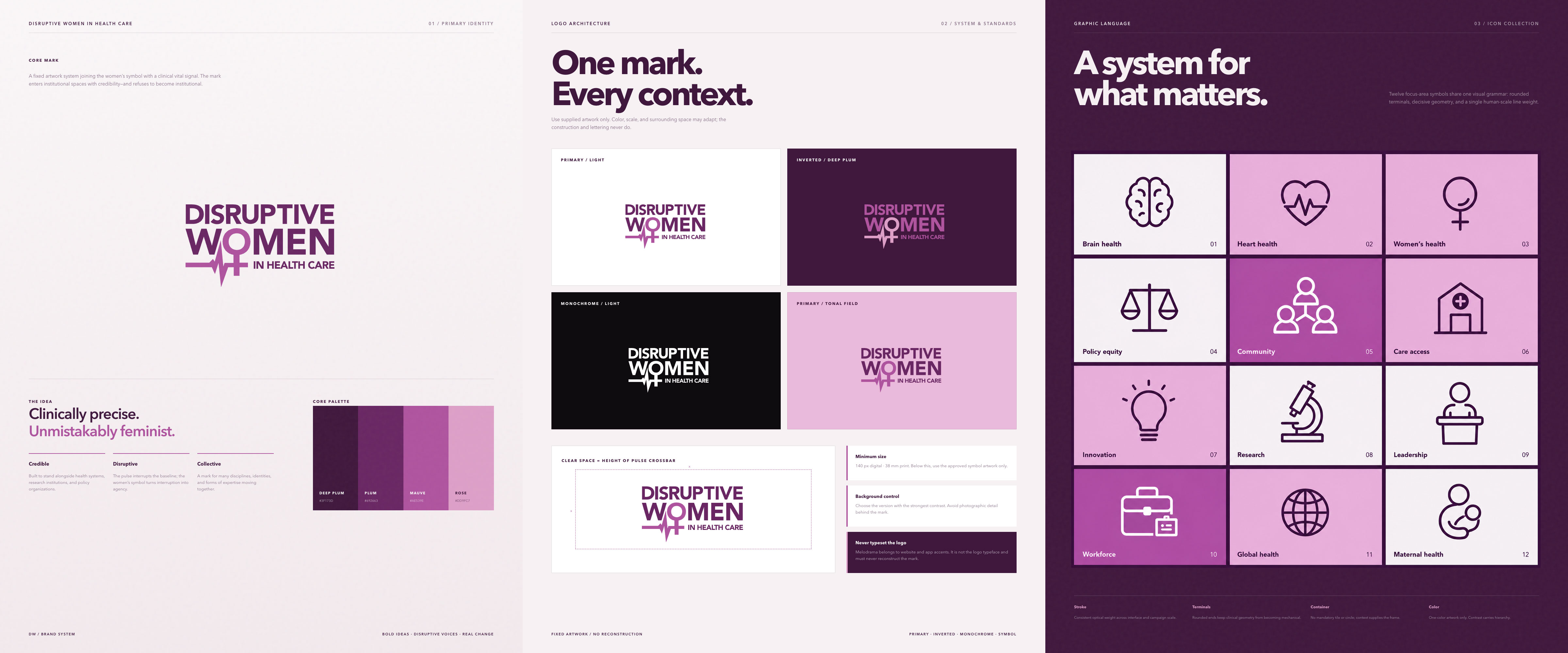
A mark for an organization that walks into rooms full of institutional logos, from AHA to AHIP to NIH, and has to read as both medically credible and unambiguously feminist. Neither quality could soften the other. Two symbols fuse at the apex: the feminism mark and the health monitor line. Clinically precise, and unmistakably feminist.
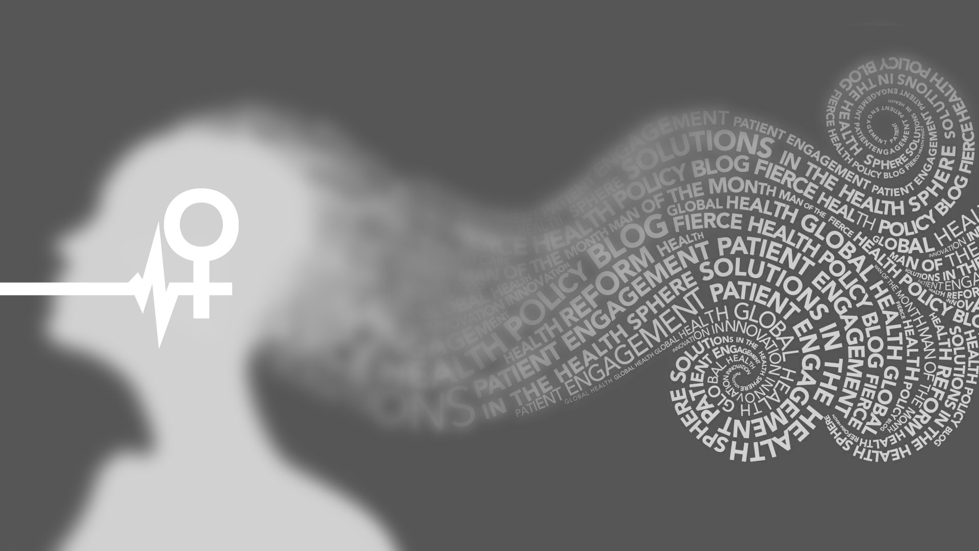
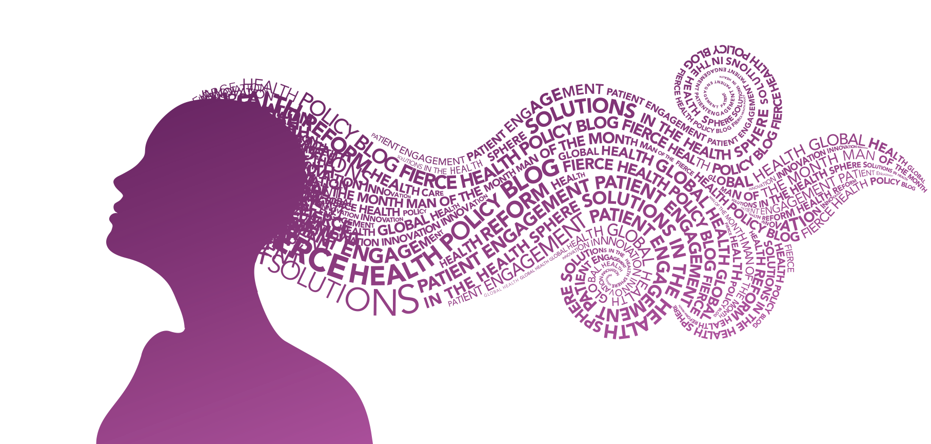
The logo lands immediately. Hygieia rewards the reader who comes back. A typographic portrait of the Greek goddess of health — her hair drawn from the tenets of healthcare, strand by strand. Equal parts poster art and medical diagram. A primary identity built for the scan; a companion mark built for the look that follows.
The editorial platform covers twelve distinct health focus areas. Each needed a visual anchor precise enough to scan at 16 pixels — drawn for this system, built for these topics. A custom icon set extends the brand’s graphic language into function: health-themed silhouettes, on-system, one per focus area.
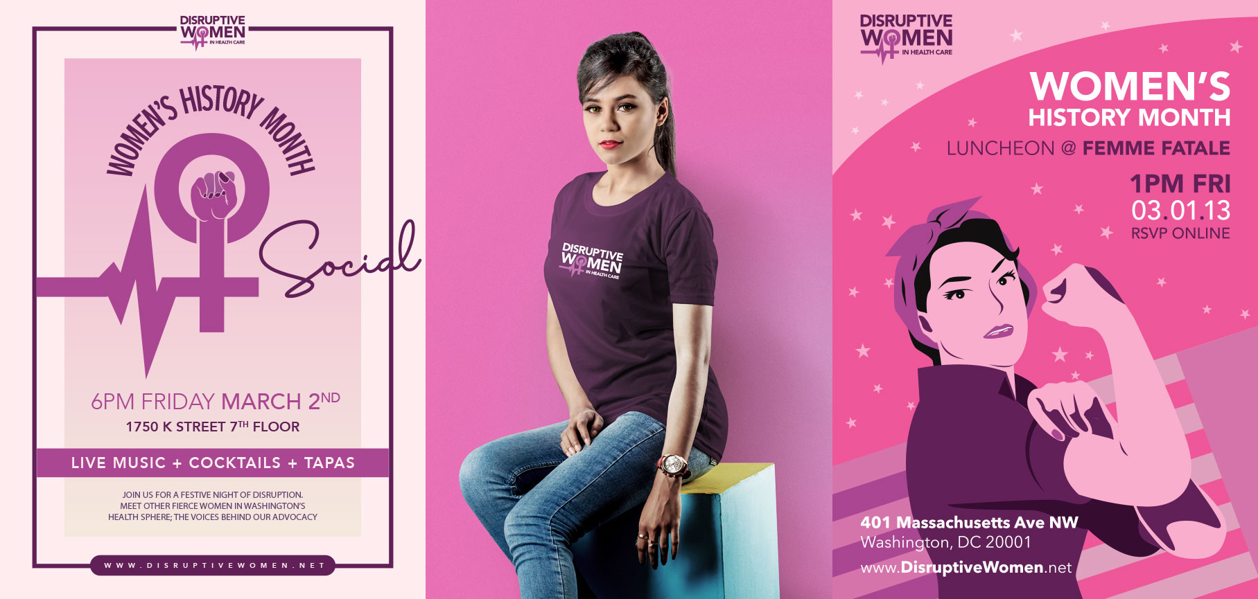
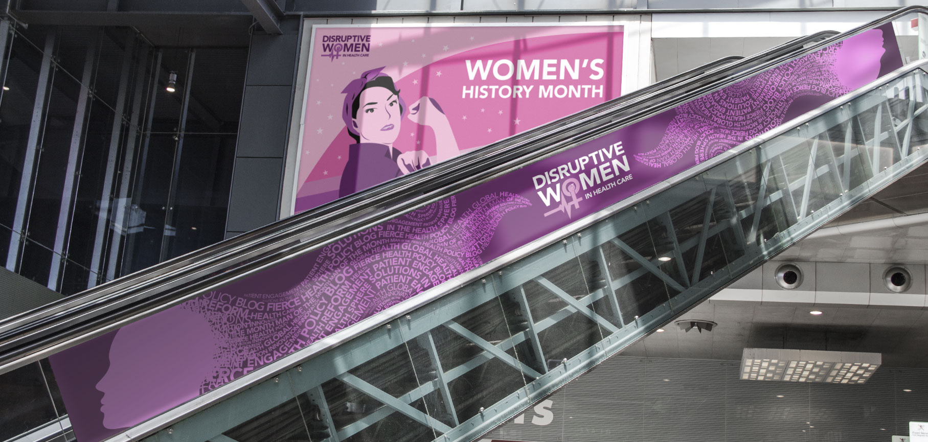
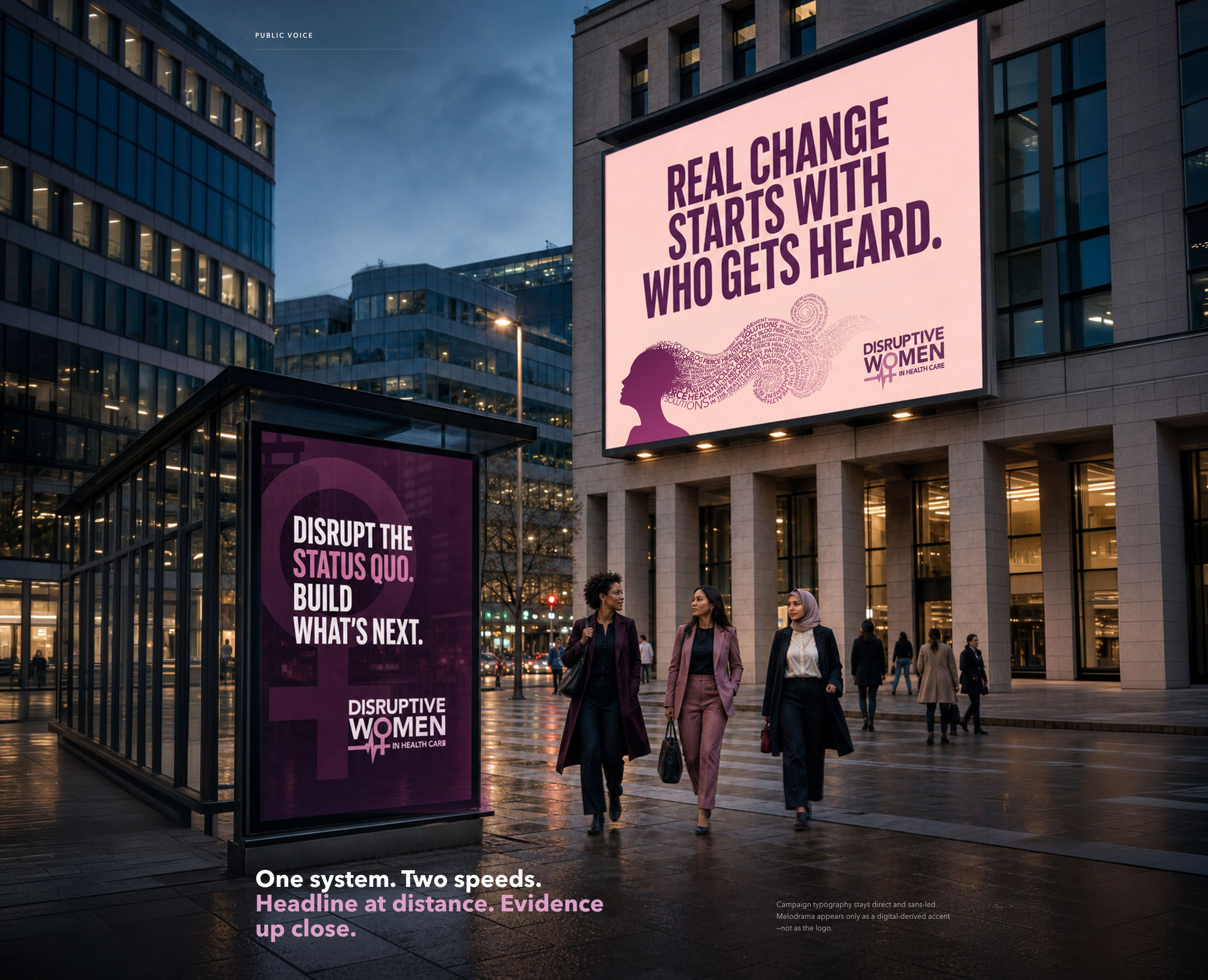
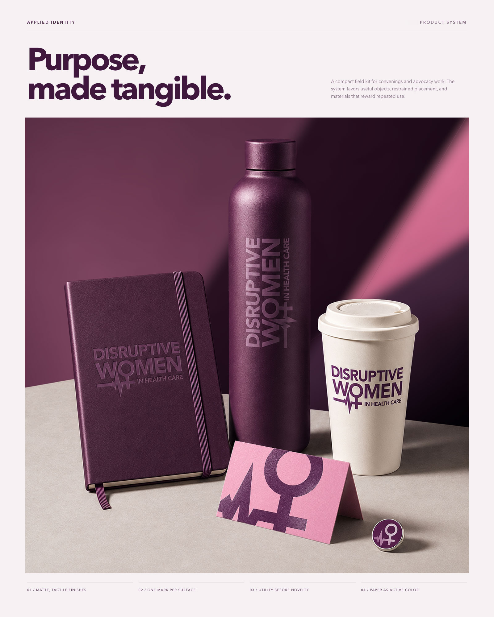
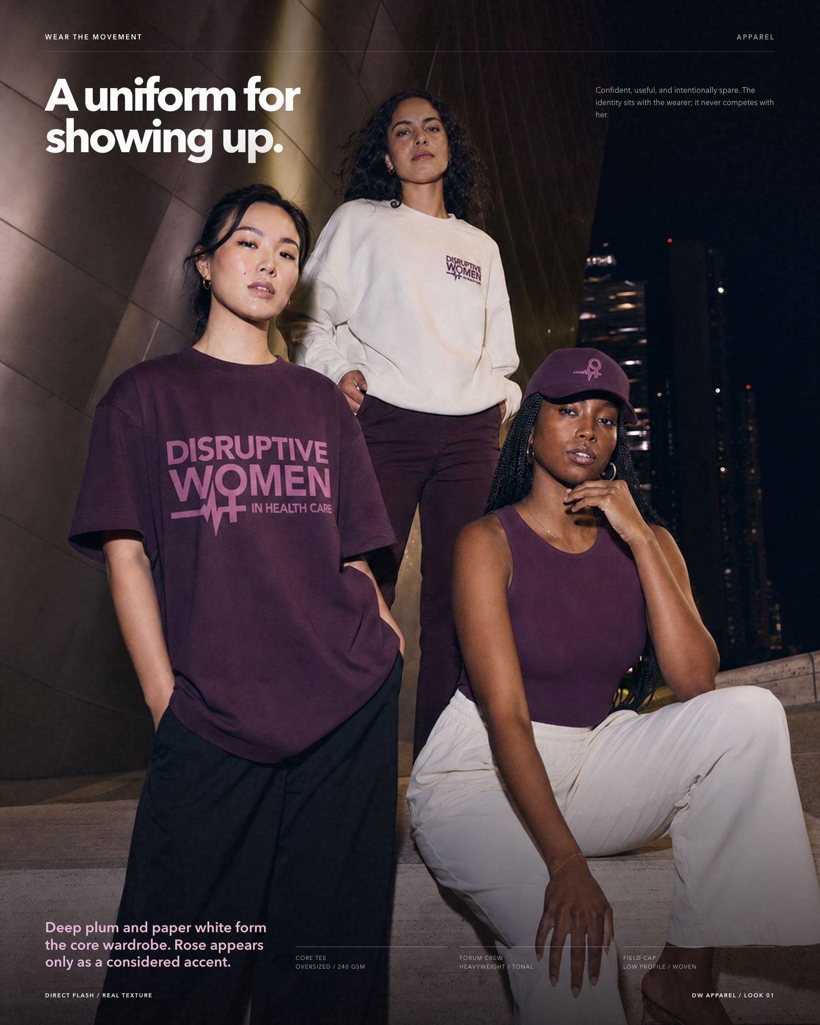
The identity had to hold up past a browser tab: a delegate kit for the policy forum, drinkware and field notebooks handed out at events, apparel worn in the room and on the street, transit and out-of-home placements in a conference district. Same plum, same mark, same directness, whether it’s sitting on a lanyard table or three stories tall on a building facade.
A public platform for private courage.
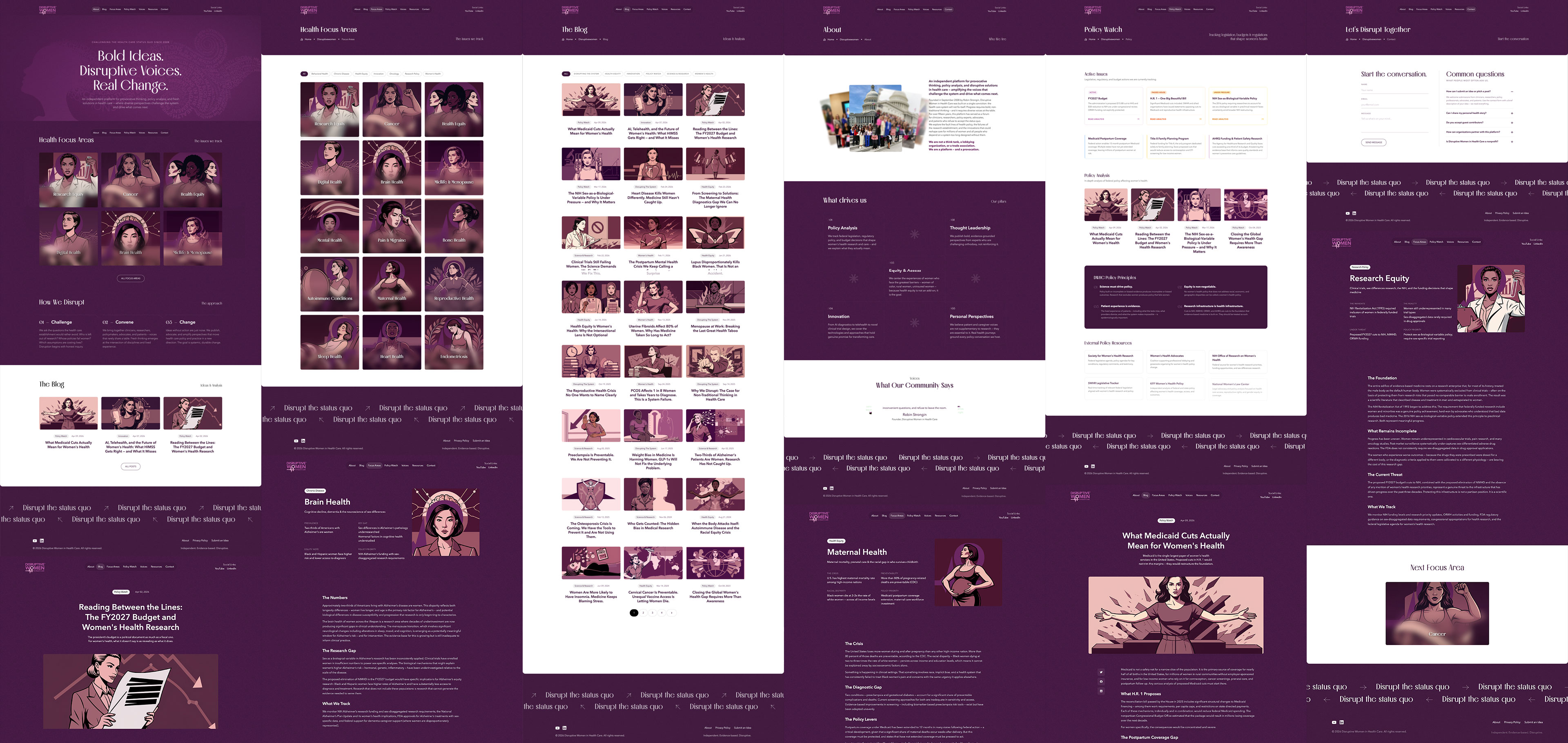
For over eighteen years, this platform has been a provocation. The redesign had one job: look like it means it.
The visual anchor is a custom illustration system built from the ground up: every blog post, every health focus area, its own portrait. Bold linework, deep plum and mauve, subjects drawn with graphic novel intensity. Not decoration — identity. A system that tells you whose platform this is before you read a word.
The palette is fixed: near-black purples on every surface, magenta cutting through as accent, a serif display voice for editorial authority and clean sans for everything that needs to move. Nothing neutral. A platform that looks the way it argues — without apology.
Explore a live copyConsistent without being quiet.
Bold enough for the fight.
Credible enough for the policy table.
A speculative mobile companion for the health advocate who is always in motion: between the examining room and the committee room, between a clinical observation and a published position. Five tabs, five verbs, one continuous surface for advocacy work.
The design problem was personalization without profiling. Members declare their focus areas at onboarding: mental health, reproductive rights, rural access, and the system calibrates from that signal. Every feed, every event recommendation, every suggested connection reflects what she defined about herself. Members as the intelligence layer.
The AI layer shows up in three moments. Ambient capture during live sessions. A structured briefing when the session ends. And source attribution on every post in the Voice feed, so the member knows what she’s reading before she amplifies it.
Explore the app walkthroughMembers as the
intelligence layer.
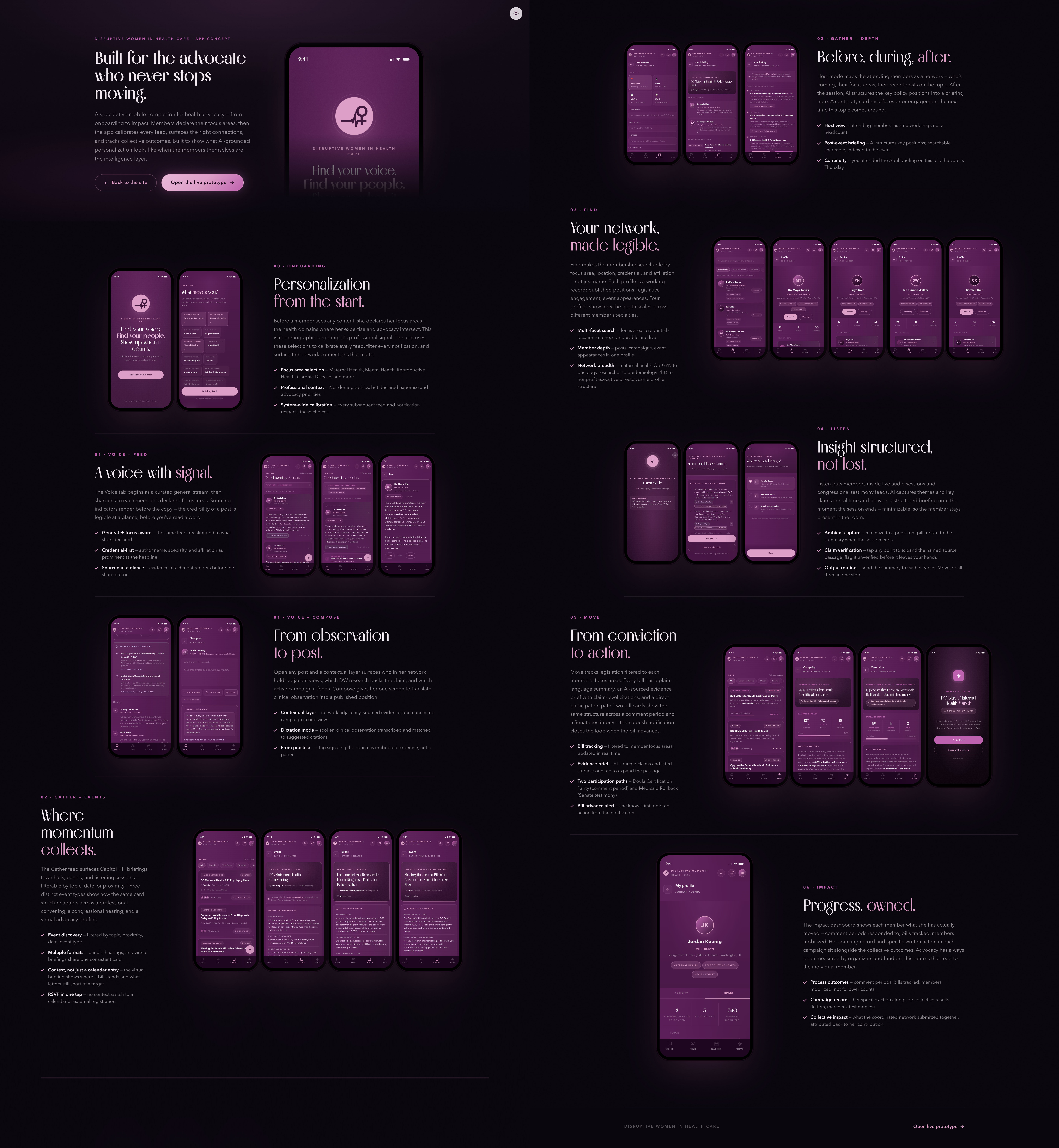
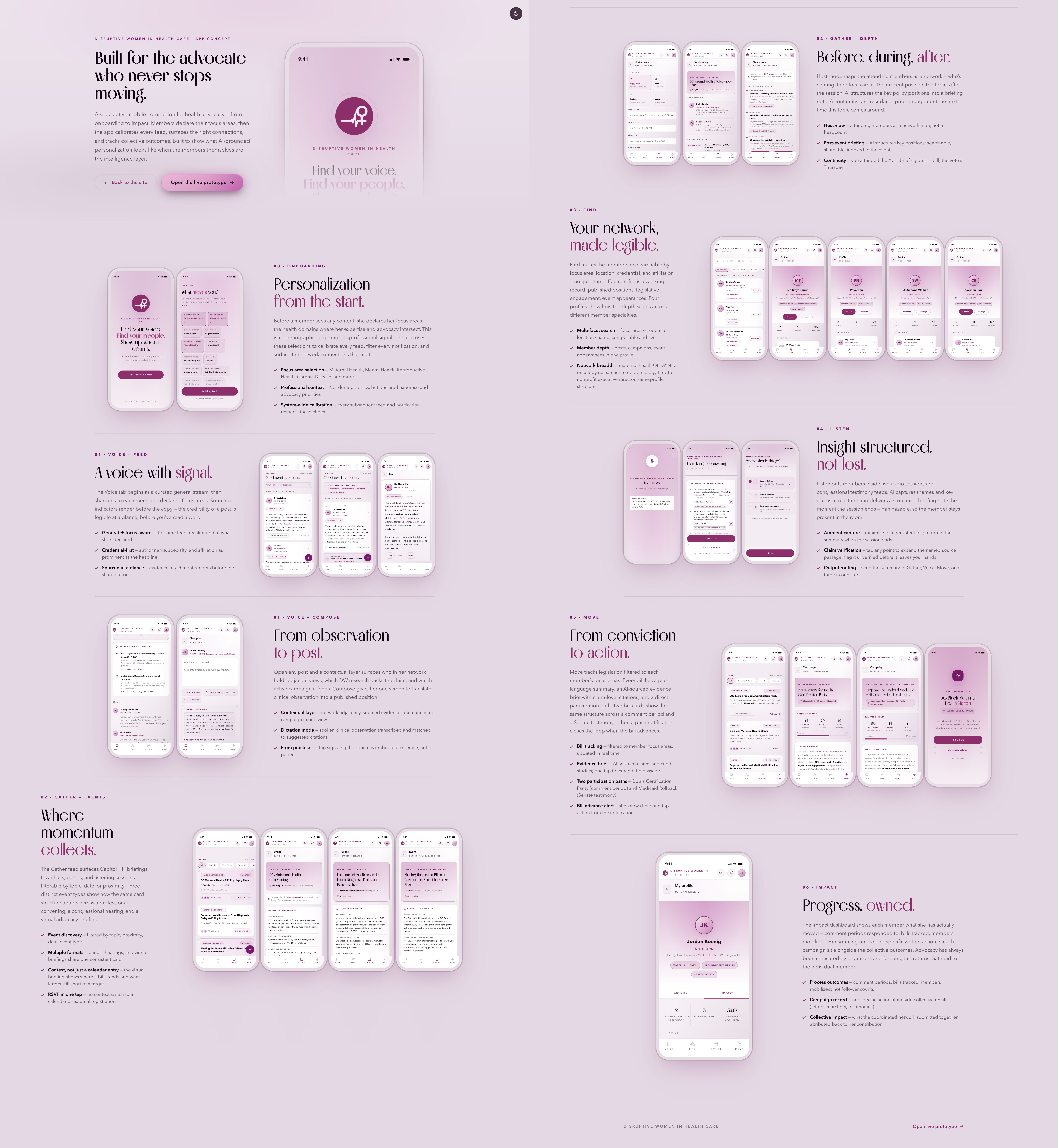
Plum anchors the surfaces; rose drives accent and interaction. Every named color carries a documented purpose, not just a swatch: the interactive rose was checked against the background it actually sits on, not assumed safe, and it clears the accessibility standard with room to spare. Motion follows the same discipline: every transition in the app turns off automatically when a member has Reduce Motion enabled on her device.
See the full token setChecked, not assumed.
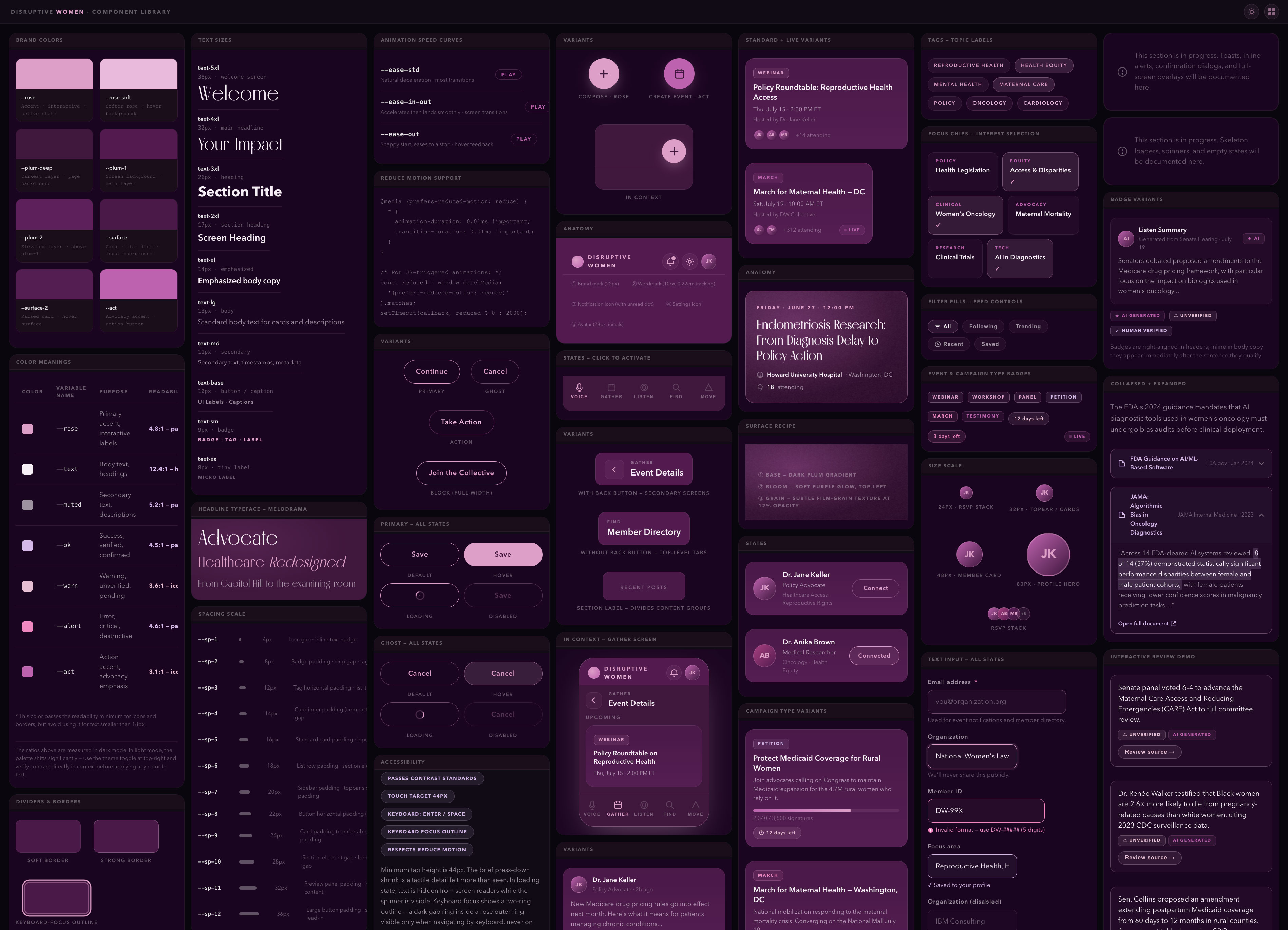
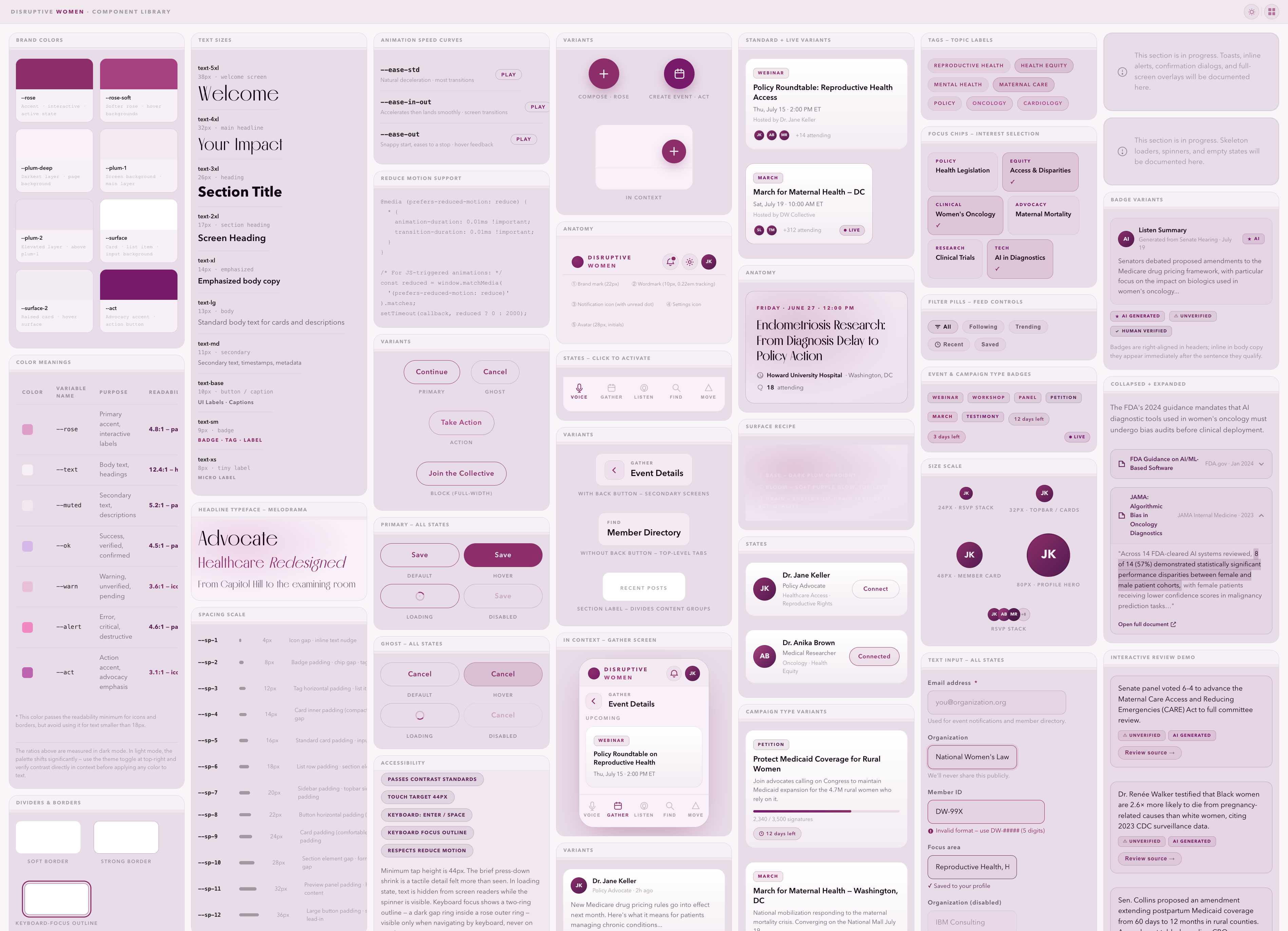
Every interaction is built from a documented design system: tokens first. Color, type, spacing, motion, easing curves: eighteen variables define how every component moves and where it sits in hierarchy. The deep-plum brand palette maps to semantic roles so components behave consistently across all 24 screens.
Transparency required its own components: source attribution opens inline, collapsed by default and expanded on demand, so a member can trace what the AI summarized back to the session transcript before it leaves her hands.
Explore the component libraryThe app didn’t start from a blank screen. I gave Claude the existing site: its deep-plum palette, the Hygieia icon language, the written voice built up over years of the organization’s own advocacy content. It proposed screens and component directions from that material; I chose which ones actually served a health advocate moving through her day, and rebuilt the rest until they did.
The material was already real; the choices were still mine.
The American Heart Association brought national reach. Keeping the platform’s voice intact inside it was the design problem. The campaign film opens on the organization’s own mission, driving change, creating chaos, finding cures, disrupting the status quo, before it ever mentions heart health: the platform’s identity leads, the partner’s cause follows. From there the campaign ran nationally on women’s heart health, a cause the platform had championed since its founding, reaching practitioners, patients, and the policy rooms it was built to influence.

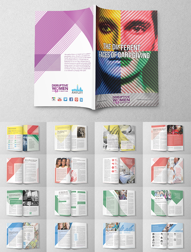
A blog post disappears into a scroll. Disruptive Women built full digital magazines instead: real issues, real bylines, a masthead instead of a feed. The Body Image issue ran photographer Rick Guidotti’s portraits of people living with genetic difference alongside essays on aging, disability, and race.
A masthead,
not a feed.
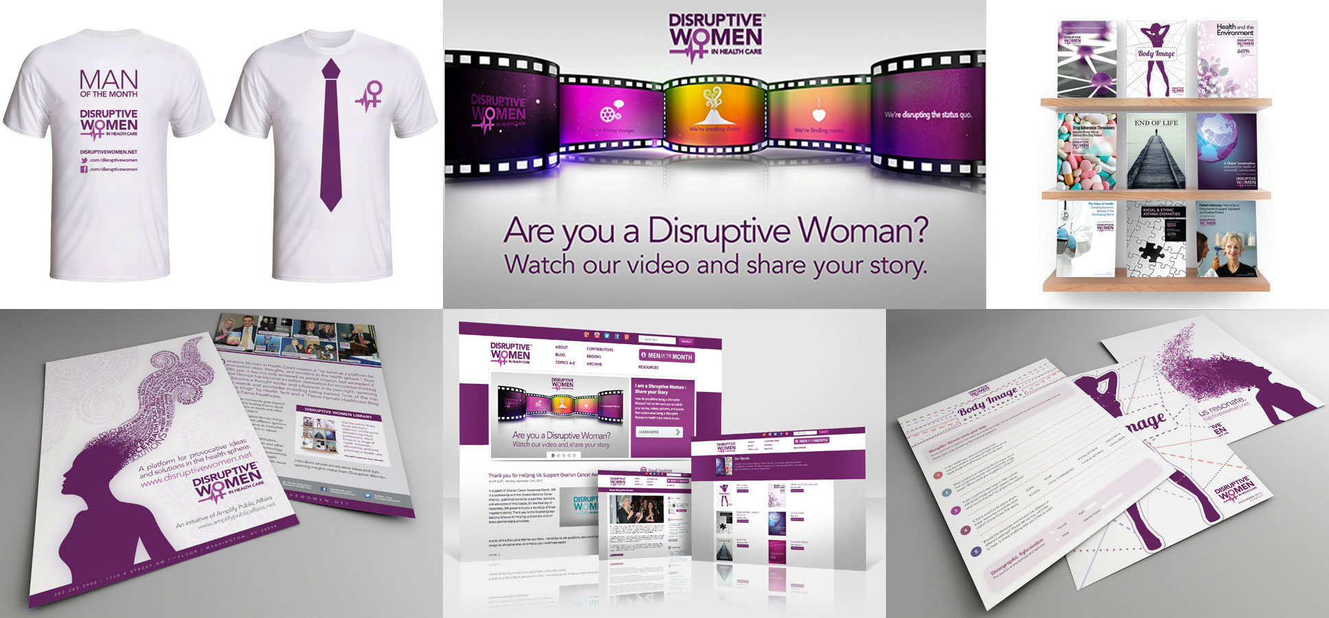
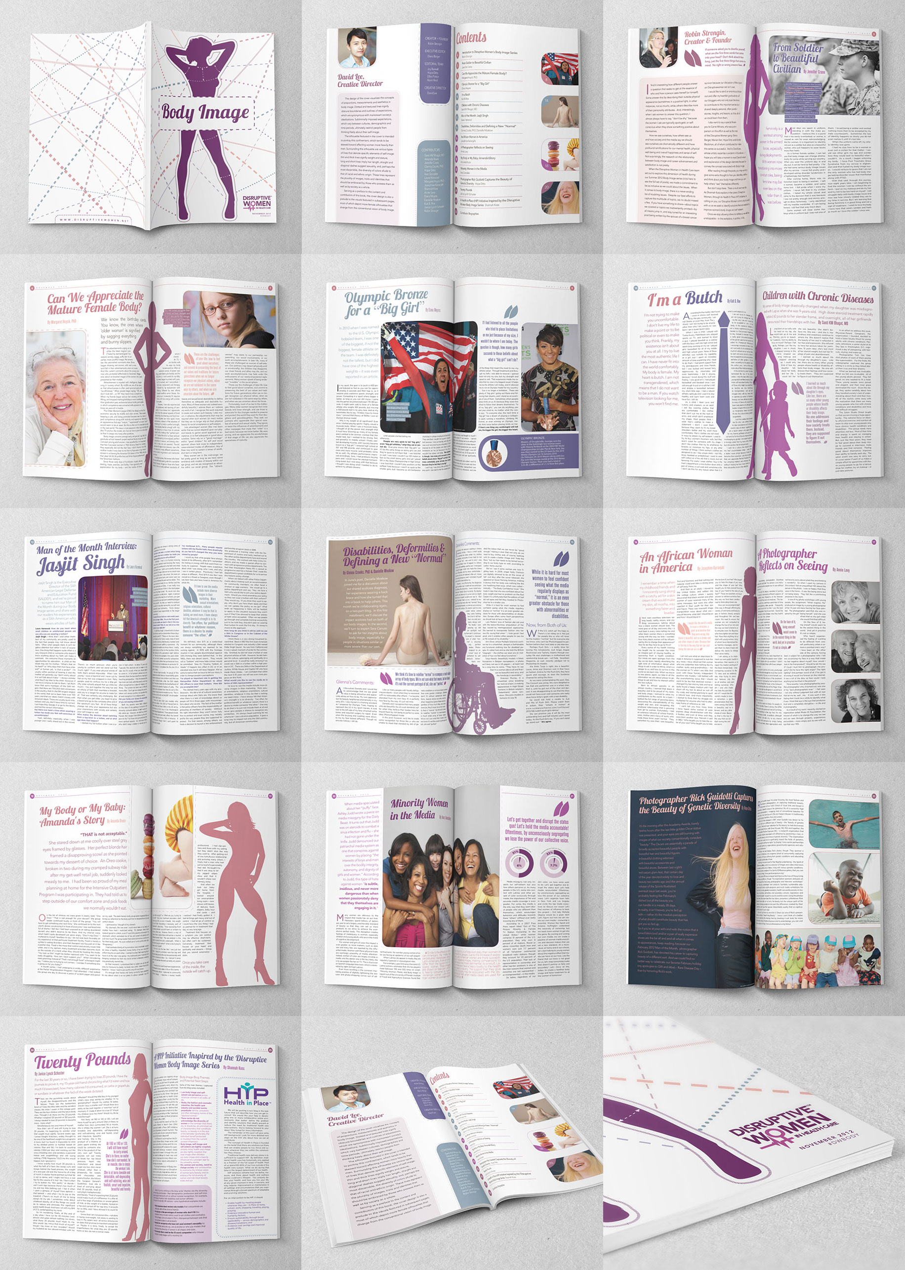
Formal occasions tend to be where a bold brand goes safe. Women’s History Month called for a commemorative treatment — gala signage, printed material, a logo variation calibrated to the occasion. The graphic conviction held. Every touchpoint built for an audience that had fought to be in those rooms.