



A five-year support contract, renewed for five more.
Mondelēz wanted one partner to support SAP and custom platforms worldwide. The selection turned on cost and IBM’s ability to improve how support worked. IBM needed to show how automation and AI-assisted support tools could lower costs, improve day-to-day service, and help the technology team work more directly with business teams. Presented as a list of separate promises, that case would have read like any other bidder’s checklist — cost claims with no visible reason to trust the operating model behind them.
For the 2017 bid, I led the art direction, motion direction, and visual system across a workshop environment and microsite. I paired seven parts of IBM’s support plan with recognizable Mondelēz product lines, giving the technical commitments a structure people could follow across the room and online. These engagements contributed to IBM winning a five-year contract in 2018. Mondelēz later renewed the agreement for another five years.
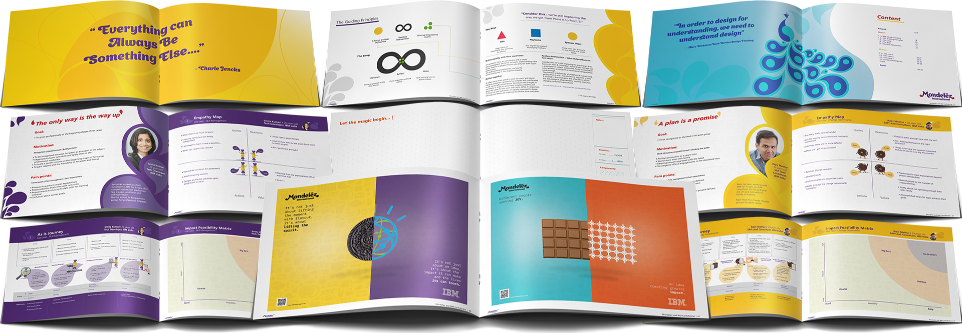
After the initial award, the same system expanded for a 2019 visit to IBM’s Bangalore center through environmental graphics, engineering-team trading cards, and a 23-page workshop workbook. In 2026, I returned to that workbook as a self-initiated exercise and built an undeployed 23-screen Field Guide prototype.
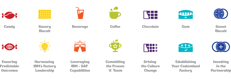
IBM had to connect its automation tools to two concrete results: lower support costs and better service. The seven commitments behind that case were not the same kind of claim: pricing and delivery model sat beside SAP capability, the proposed team, culture change, and IBM’s own financial investment. Read as a list, they looked like seven unrelated pitches rather than one operating model.
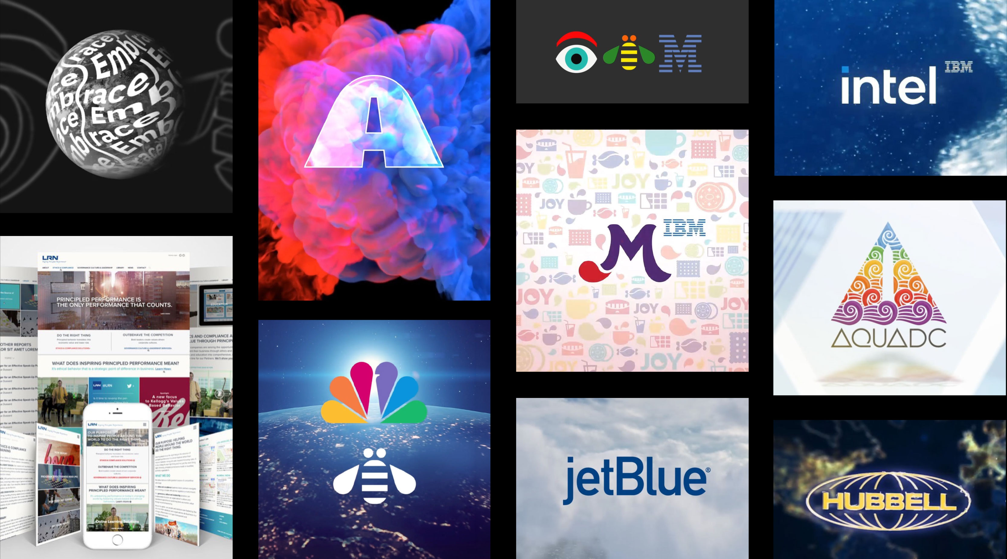
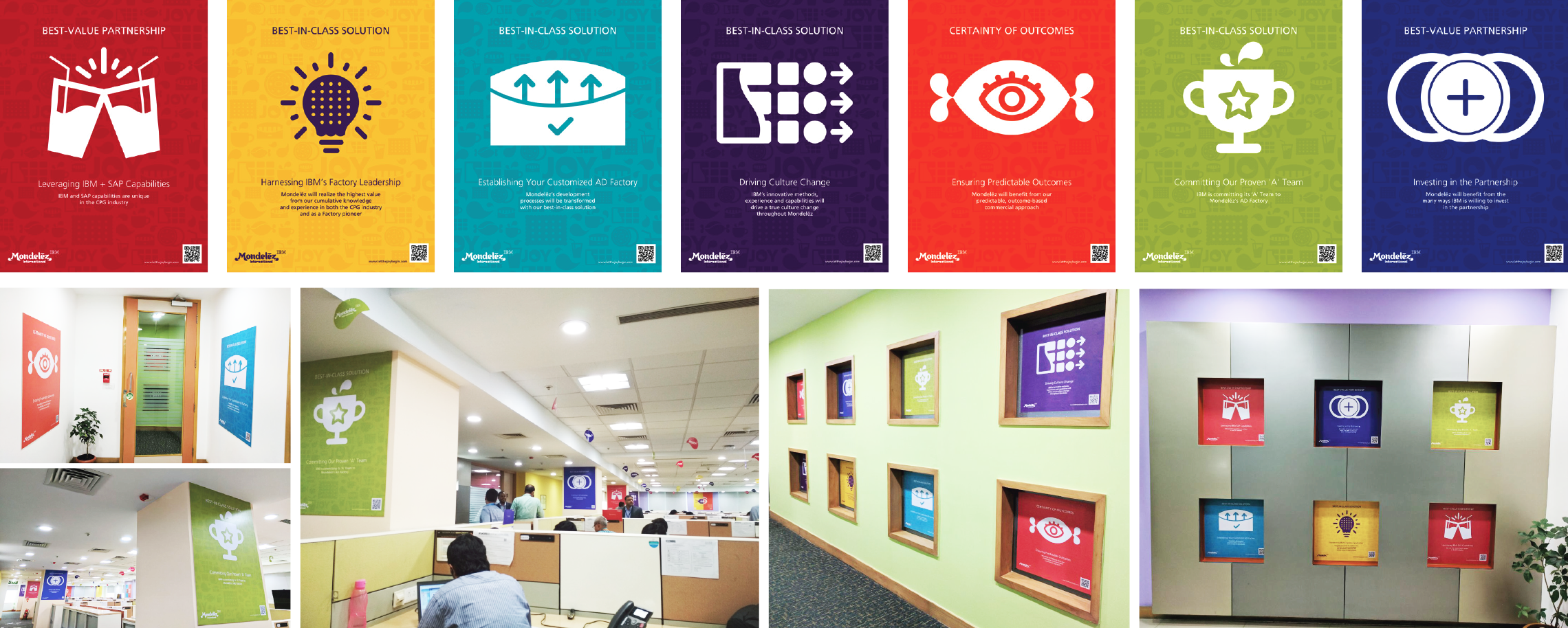
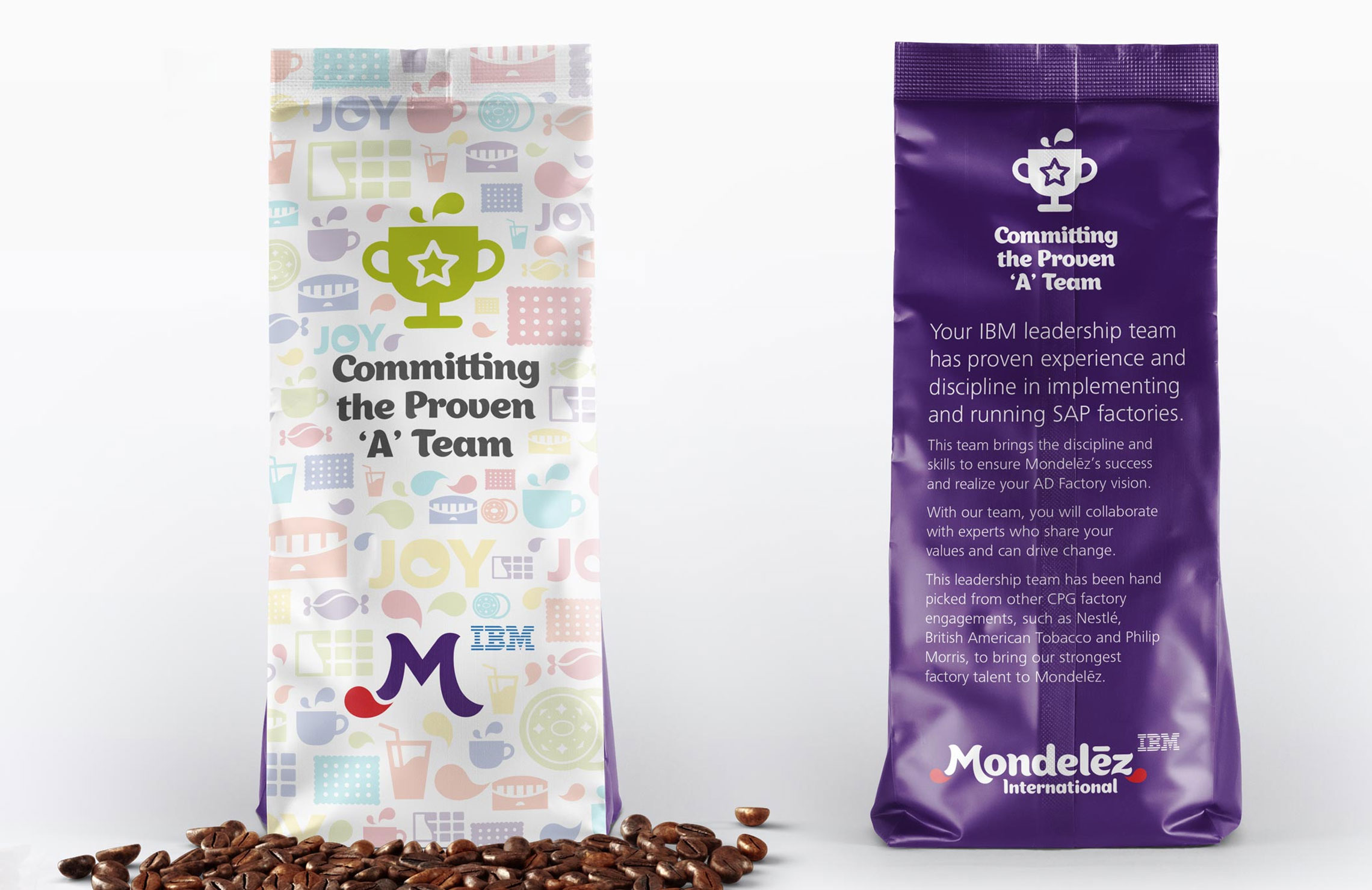
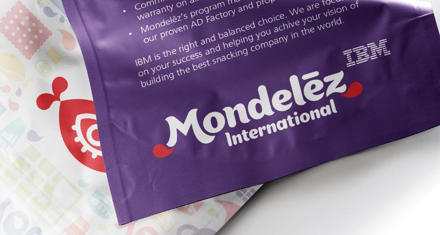
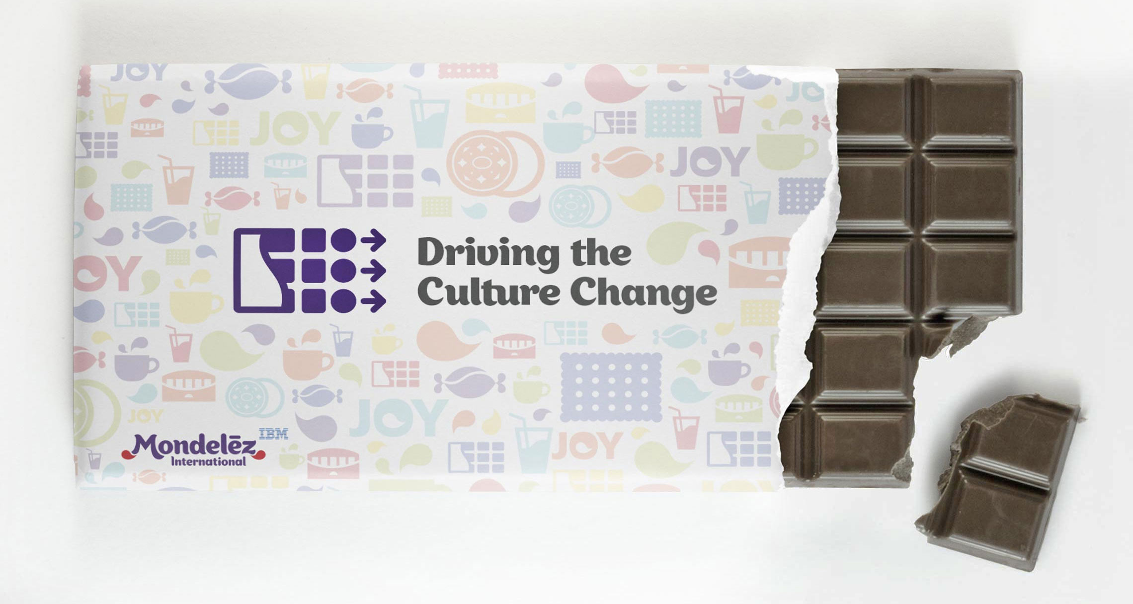
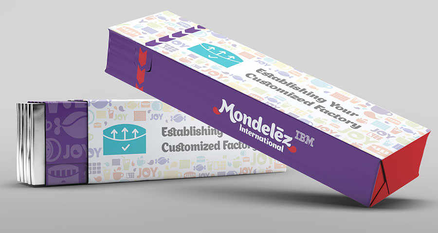
I paired each commitment with a Mondelēz product line, then redrew each product’s icon into a symbol for its commitment: the candy’s silhouette closed around an eye for predictable outcomes; the coffee cup bent into a trophy for the proven ‘A’ team. Which product went to which commitment carried no meaning on its own — the meaning lived in what the icon became. Redrawing rather than replacing gave seven different kinds of evidence one shared visual language, and kept the conversation anchored in the company Mondelēz actually is, not only in the infrastructure and cost it was arguing for.
Seven different arguments, one visible system.
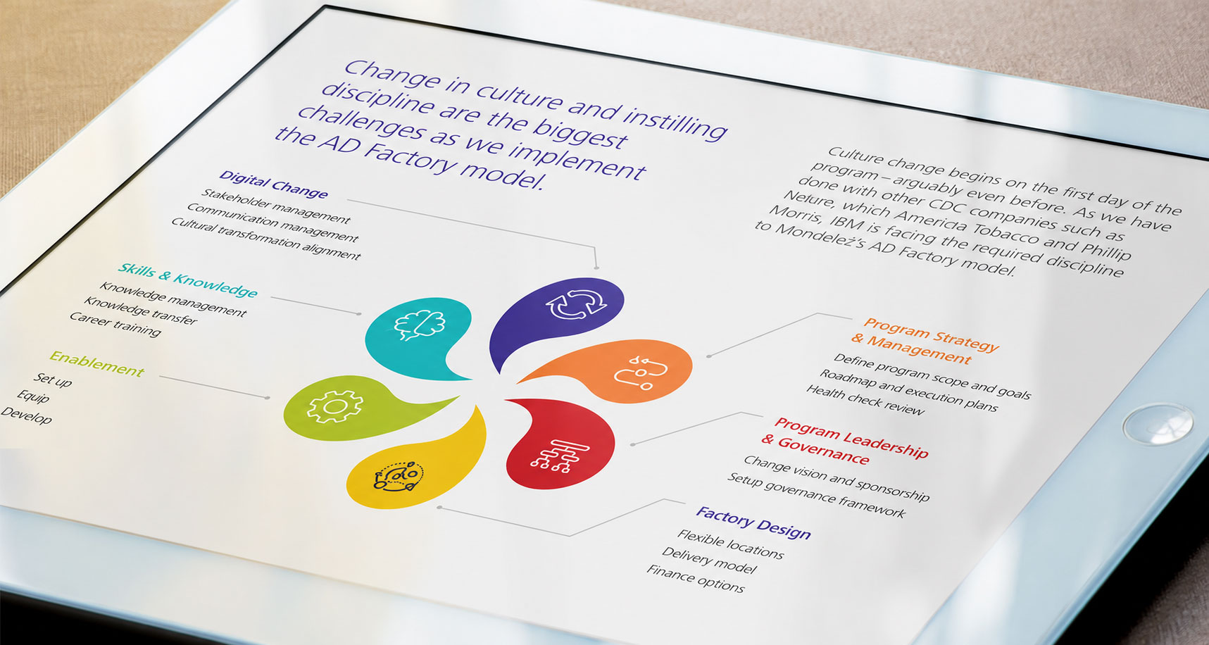
The proposal needed people to react and contribute, not just watch a presentation. The seven-commitment framework carried onto placemats, wall graphics, printed decks, and screens in the Chicago workshop, giving the room one shared reference while the conversation moved between cost, automation, people, and delivery.
The same framework appeared on screen, paper, and walls.
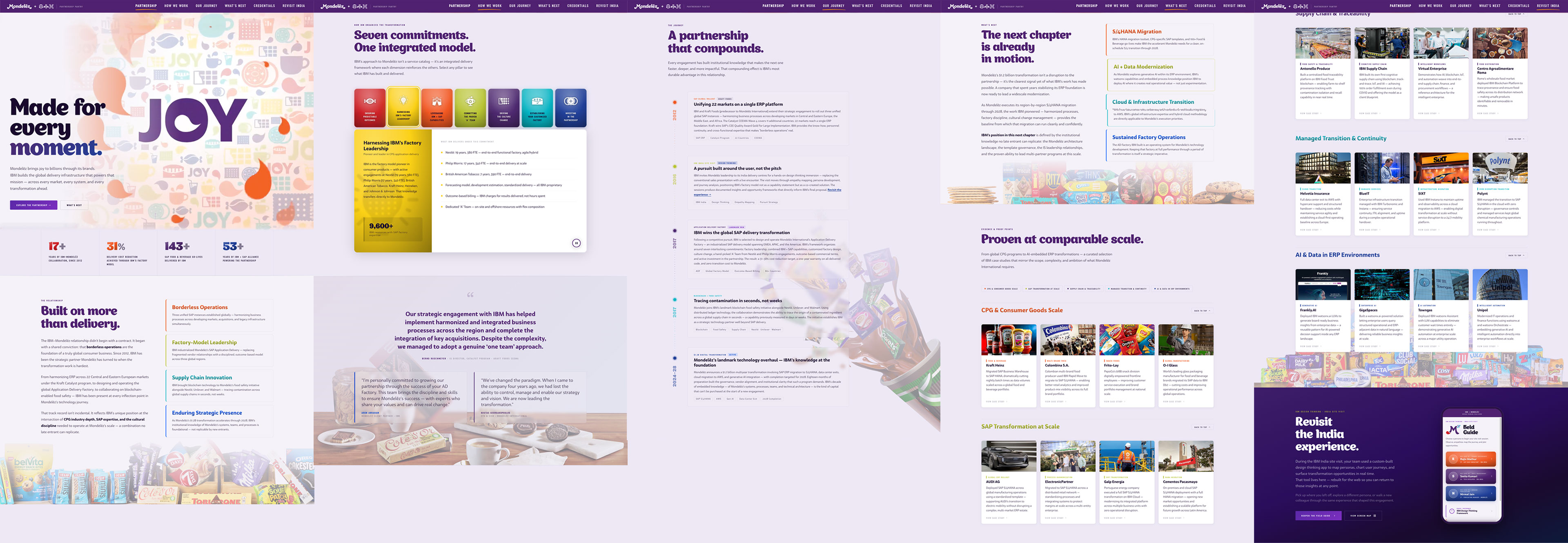
The bid extended beyond a single meeting. The microsite kept IBM’s seven service commitments and automation plan in one place. Its structure anticipated that the relationship would keep changing: new engagements could be added without rebuilding the original case. After the award, it expanded to include the Bangalore visit, then continued as a living record across four years, connecting the original bid to the work that followed.
Mondelēz could return to the same case after the room cleared.

Mondelēz selected IBM as its application-support partner in 2018. The bid materials contributed to a case for lower support costs, better service, and one team supporting SAP and custom platforms worldwide. Mondelēz later renewed the agreement for another five years, holding the original decision beyond its term.
A five-year decision that held for five more.
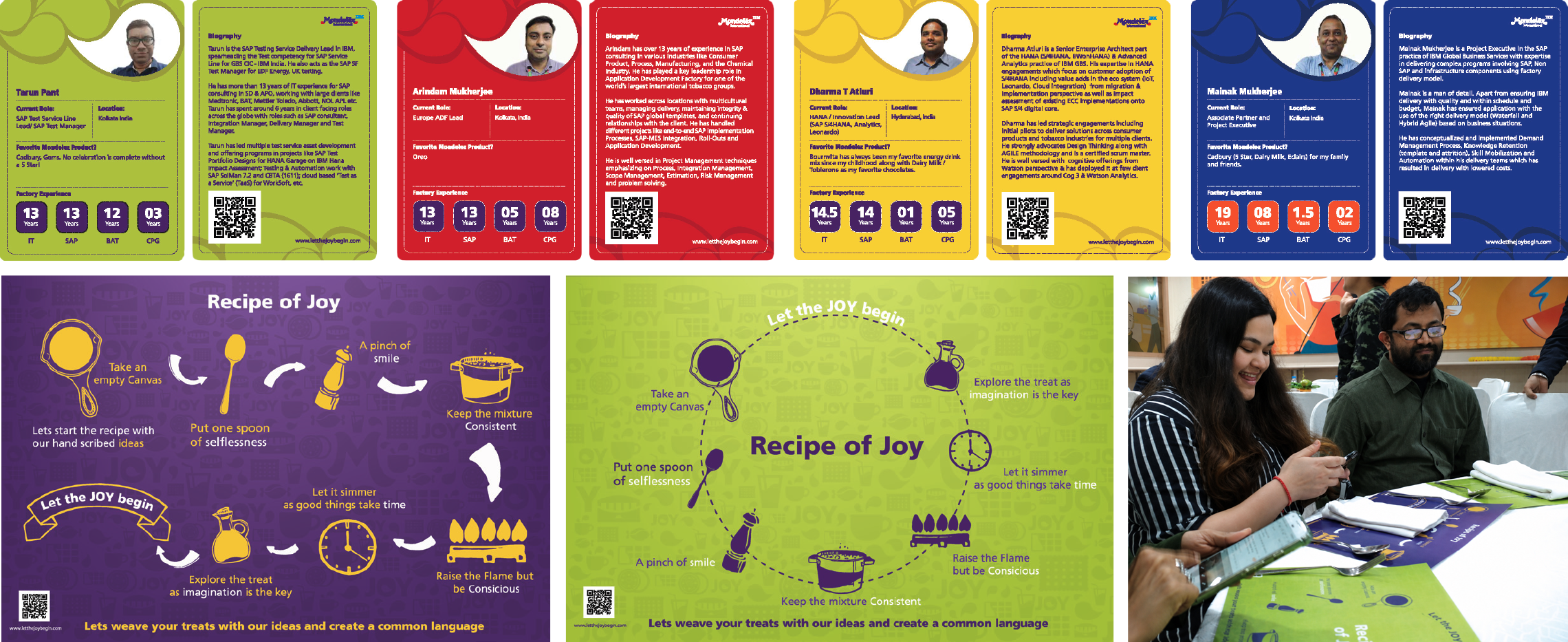
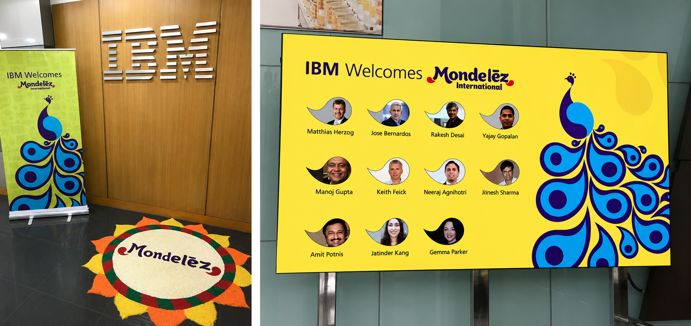
After IBM won the work, the Bangalore visit introduced Mondelēz to the engineers supporting its systems. A five-year support contract is easy to describe as an org chart and hard to feel as a relationship; the visit gave Mondelēz people to meet instead, and a sense of how those people worked. The peacock anchoring the environmental graphics was constructed from the teardrop forms of the Mondelēz mark, joining the company’s identity to a cultural symbol rooted in the Bangalore setting. Inside, engineers carried trading cards pairing their role and experience with a favorite Mondelēz product, so credibility and personality sat on the same card: Tarun chose Oreo; Mainak, Cadbury 5 Star. Together, the details made the welcome specific to the people and place.
Tarun chose Oreo.
Mainak chose Cadbury 5 Star.

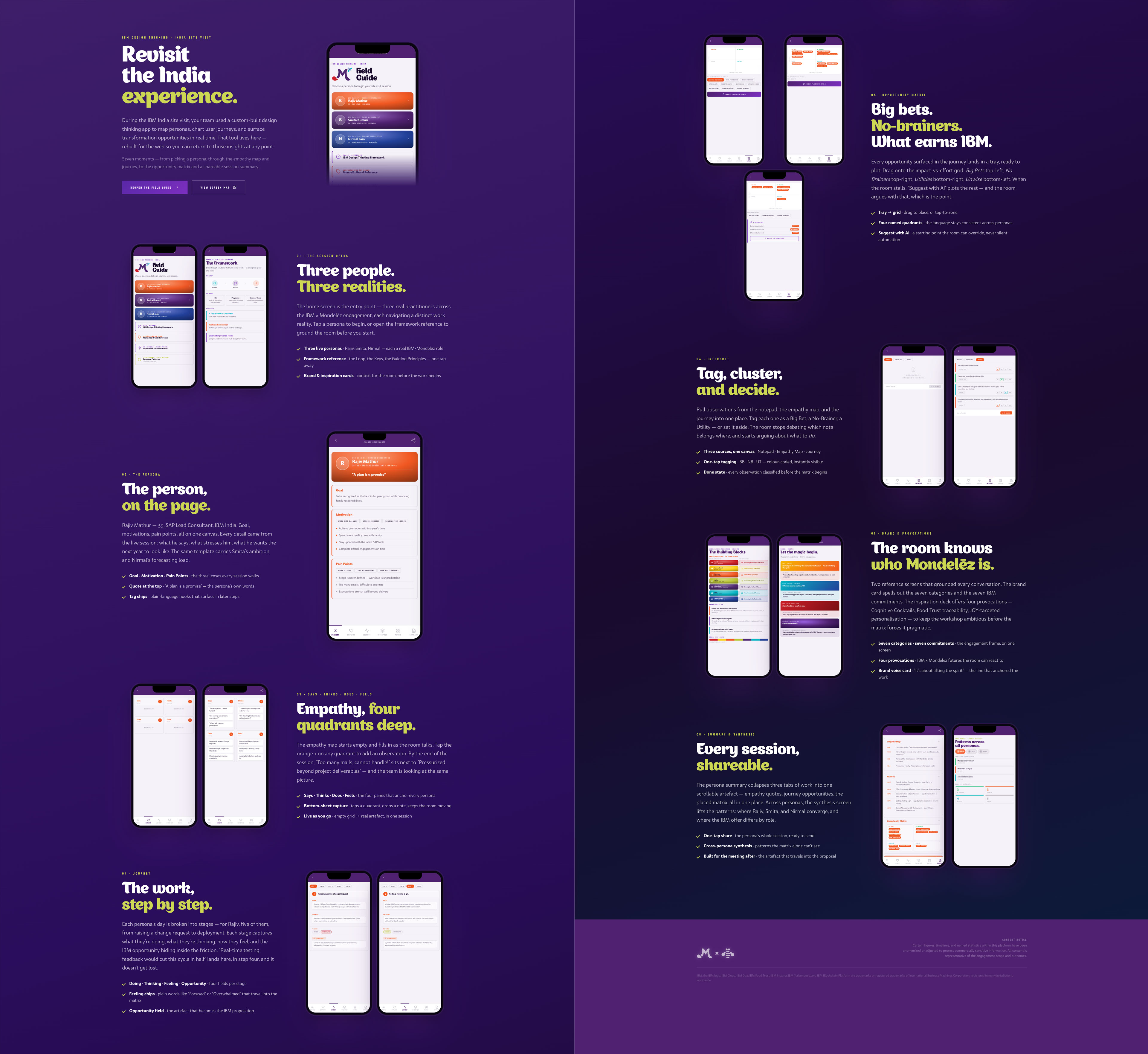
The 2019 workshop ran on print, and a facilitator could only move as fast as its pages turned. The 2026 prototype rebuilds the same session as a connected digital flow. The Field Guide translates the 23-page workbook into 23 linked screens for empathy mapping, journey documentation, opportunity placement, and summary. Each screen has its own URL, so a facilitator can jump straight to Smita’s matrix, Nirmal’s journey, or any other session state mid-room, instead of hunting for the right page.
The facilitator could enter exactly where the room needed them.
A live workshop depends on context carrying from one exercise to the next. Six tabs carry one practitioner through the full IBM Design Thinking loop: Persona, Empathy, Journey, Interpret, Matrix, and Summary. Role, goals, observations, and feelings stay connected as the group moves from what it heard to what it should do.
The key decision sits between observation and placement. In Interpret, every empathy note becomes a card the group assigns to Big Bets, No Brainers, Utilities, or Unwise. The Matrix then makes those choices visible, while Summary gathers the session into one shareable view. The sequence preserves a line of evidence from a person’s experience to the group’s decision.
The group could see why an opportunity earned its place.
The persona flows hold the session; three shared tools hold the wider room. Brand Reference keeps the seven-pillar framework and partnership history at hand during the exercise. Inspiration & Provocations pairs four challenge prompts with IBM propositions, a standing reference for what’s possible that sits apart from the Matrix’s job of narrowing what’s next. A persistent Notepad tags observations by persona and quadrant so comments captured in motion can still be traced later.
Synthesis becomes available once two personas have matrix data: comparison needs at least two sets of placements to mean anything. It surfaces where sessions agree, where they diverge, and how placements distribute across quadrants. Separate conversations become evidence the group can compare.
The team could compare consensus and disagreement before choosing what moved forward.
In a live workshop, feedback has to be immediate and quiet. An opportunity settles into its quadrant with a small spring, and the receiving zone answers once, so the placement reads as deliberate rather than dropped. During an AI request, a steady sweep signals that the tool is working through the latency; suggestions then glide in one at a time, slow enough to read as separate recommendations rather than a single batch. Each rhythm matches the confidence of the moment: placement confirms, waiting reassures, arrival gives the room time to read.
The group stays focused on the decision.
Tap any moment to compare the three behaviors. The matrix placement springs, the AI wait state moves at a steady pace, and returned suggestions glide into place. All three appear on the same axis below.
Tap an opportunity, then choose a quadrant. The dot lands with a small overshoot and settles; the receiving zone glows once to confirm the placement.
Open Rajiv’s matrixWhen the prototype asks watsonx for help, the response takes a couple of seconds. A diagonal light bar crosses the tray at a steady pace, making the active request visible until the suggestions return.
Public demo presents the motion with AI disconnectedReturned suggestions move into their quadrants 90 milliseconds apart. The stagger gives the group time to follow each placement; the final quadrant pulses once to close the sequence.
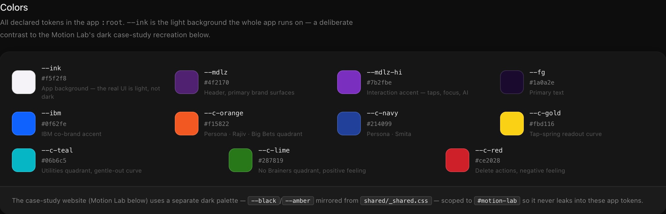
Open Nirmal’s matrixThe workshop app runs on a light background: the actual interface a facilitator used in the room. The Motion Lab below, built afterward to recreate the system for this case study, deliberately runs the opposite palette, dark and case-study-styled, so the two are never mistaken for the same artifact.
See the full token setNever mistaken for the same artifact.
A static handoff separates the interaction rules from the behavior they need to explain. I built the prototype and its specification as the same artifact using plain HTML, CSS, and JavaScript that runs directly in the browser. Motion values and comments sit beside the behavior they describe. Each of the 23 screens also has its own URL, so a collaborator can inspect Rajiv’s empathy map or Nirmal’s opportunity grid directly.
The sequence runs from persona selection through session summary. Each tile opens the rendered screen.
The behavior and its explanation stay together.
Rajiv, IBM’s SAP lead consultant, works through Change Governance. Smita, an IBM developer, works through Skill Management. Nirmal, Mondelēz’s own forecasting manager, works through Demand Forecasting: three levels of seniority, two sides of the relationship, one shared structure.
Content changes by practitioner; the interaction model stays consistent.
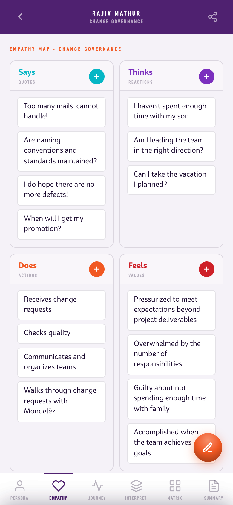
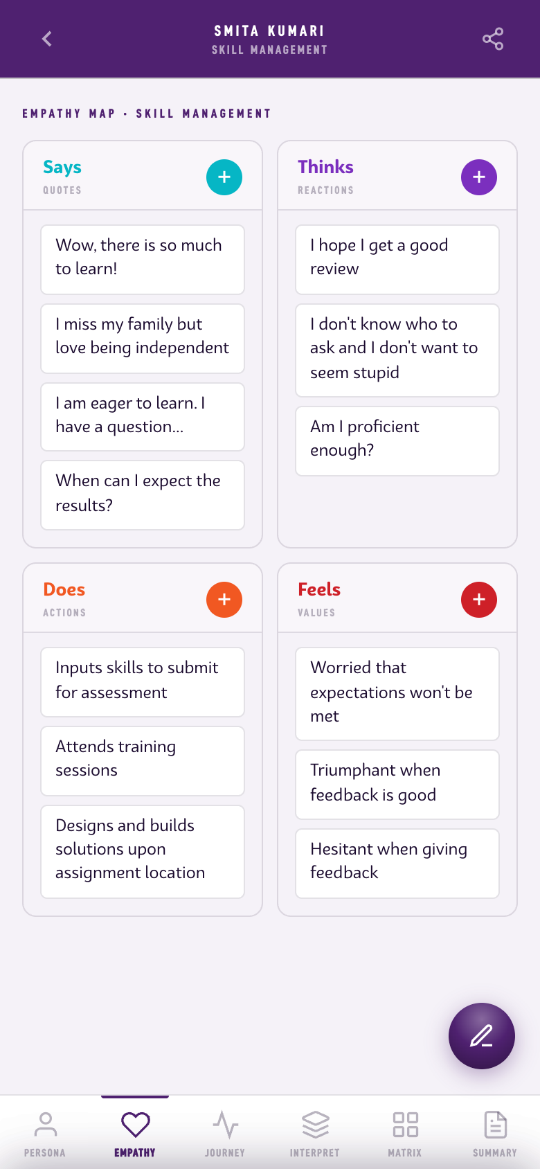
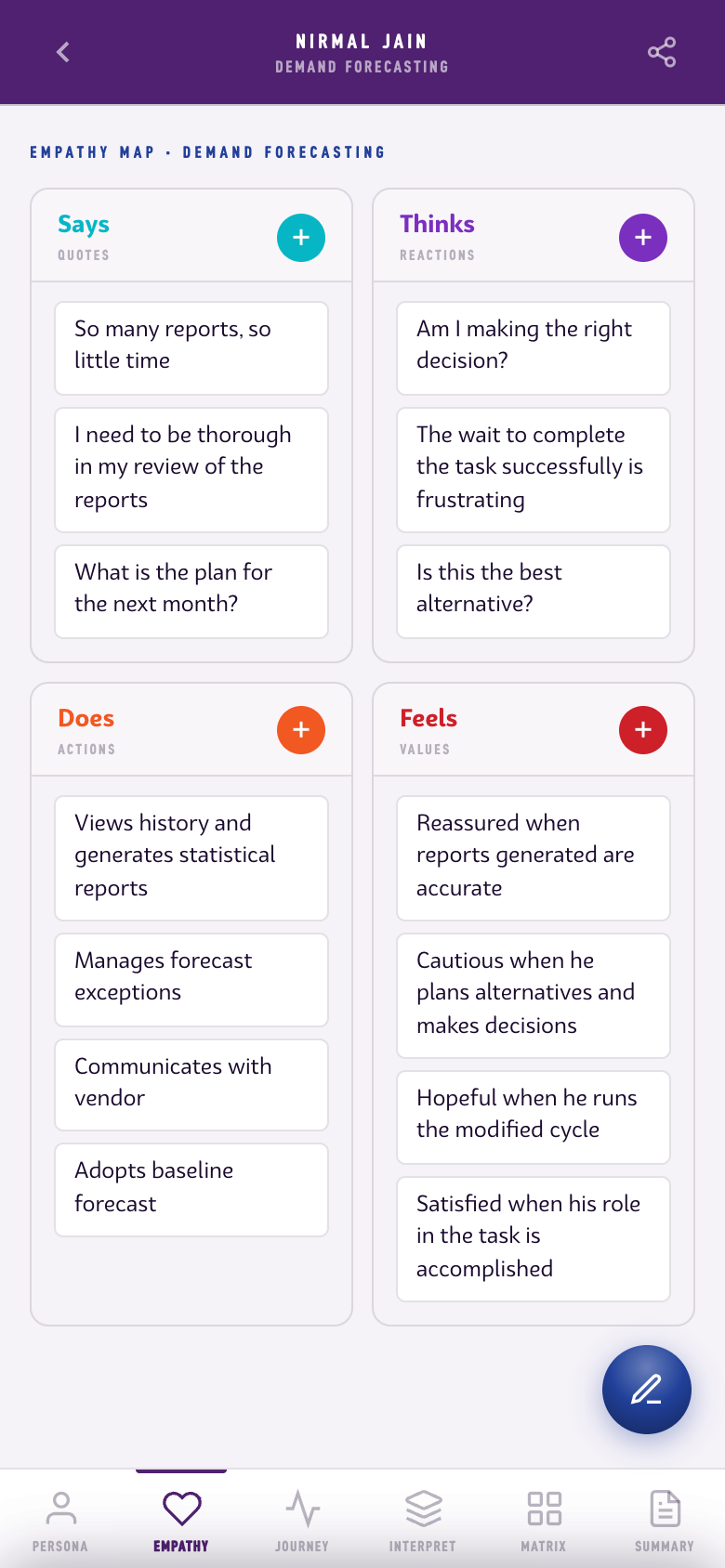
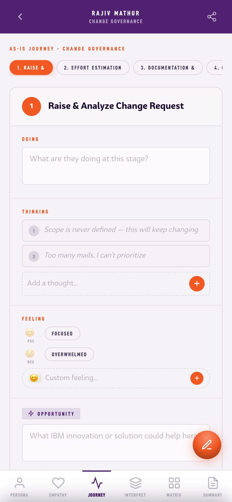

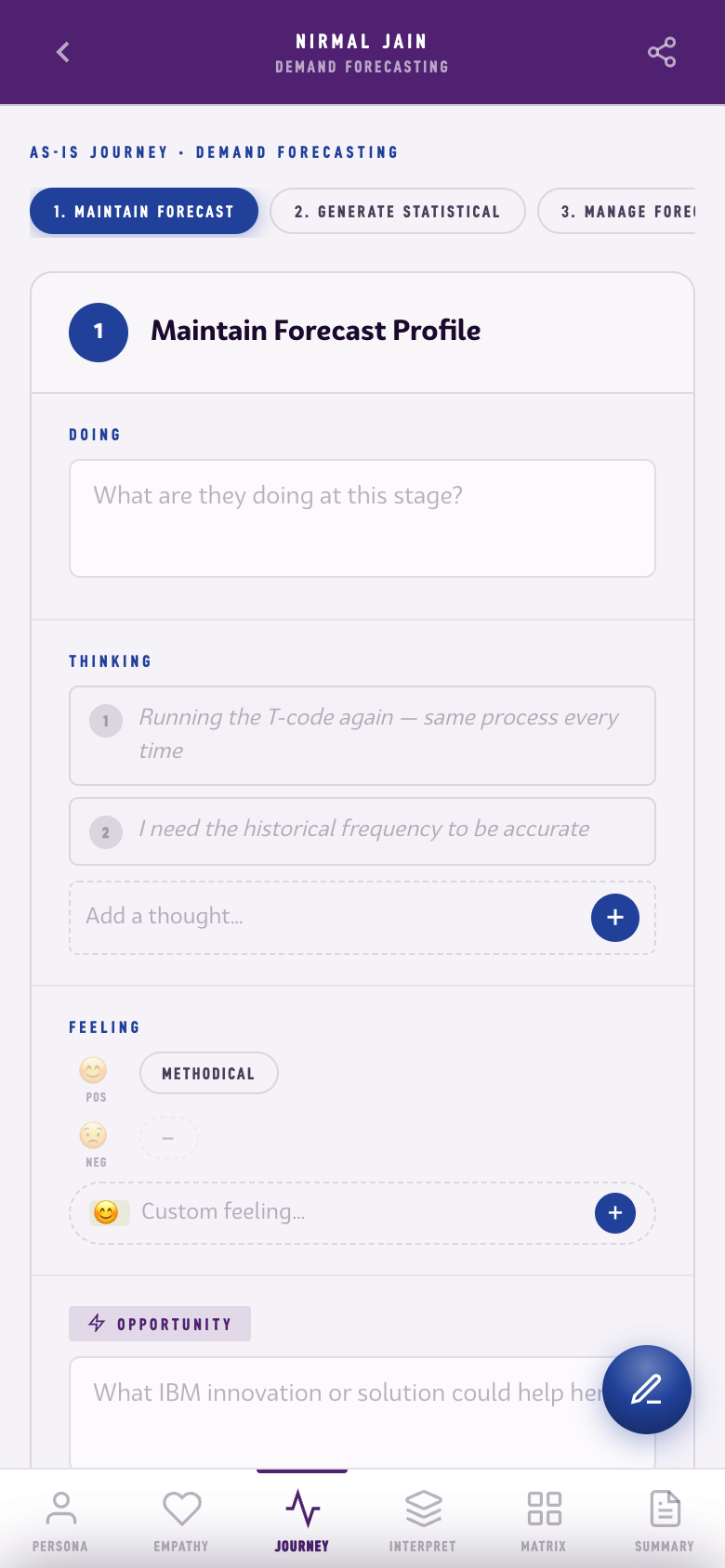
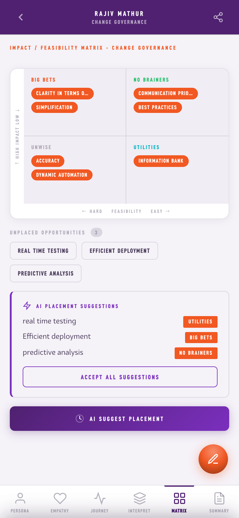
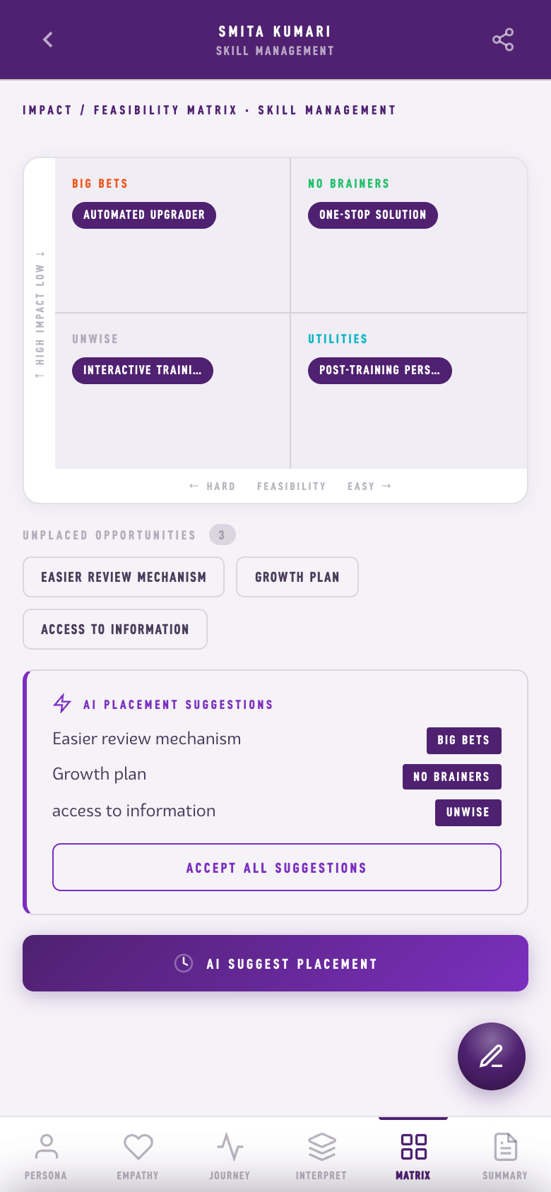
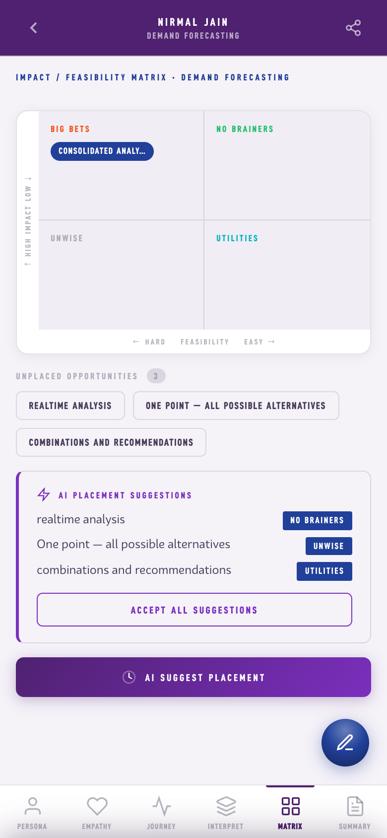
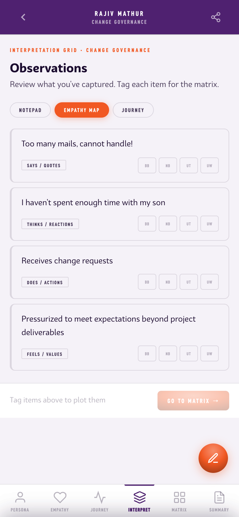
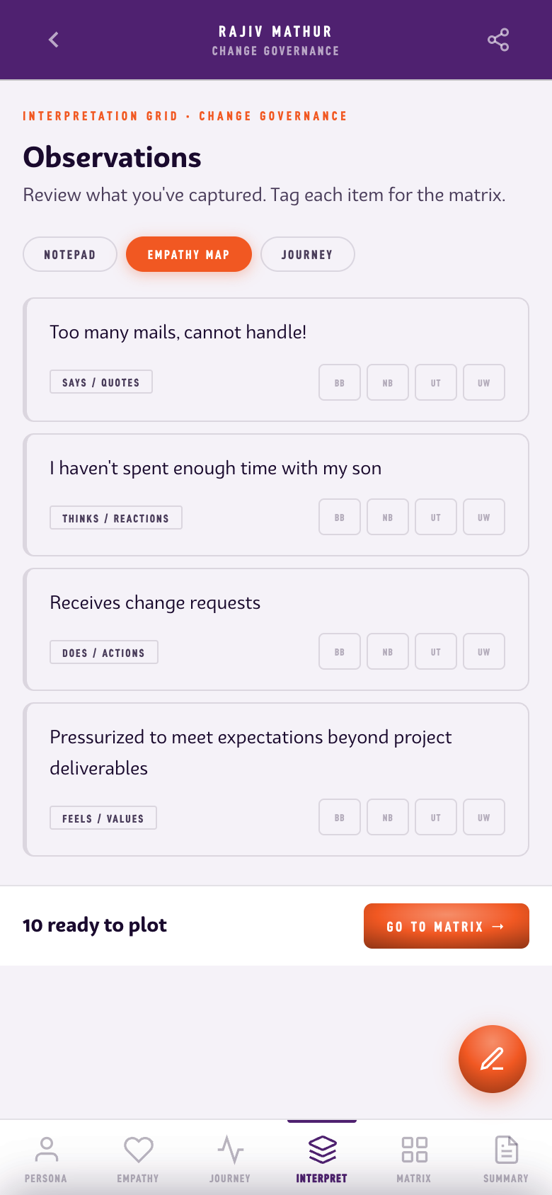
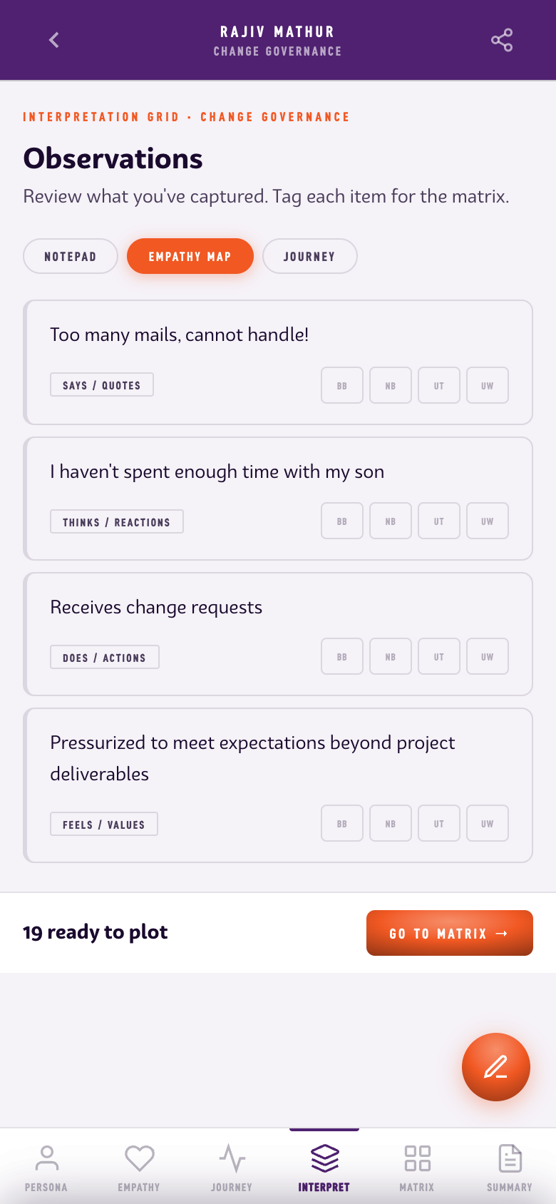

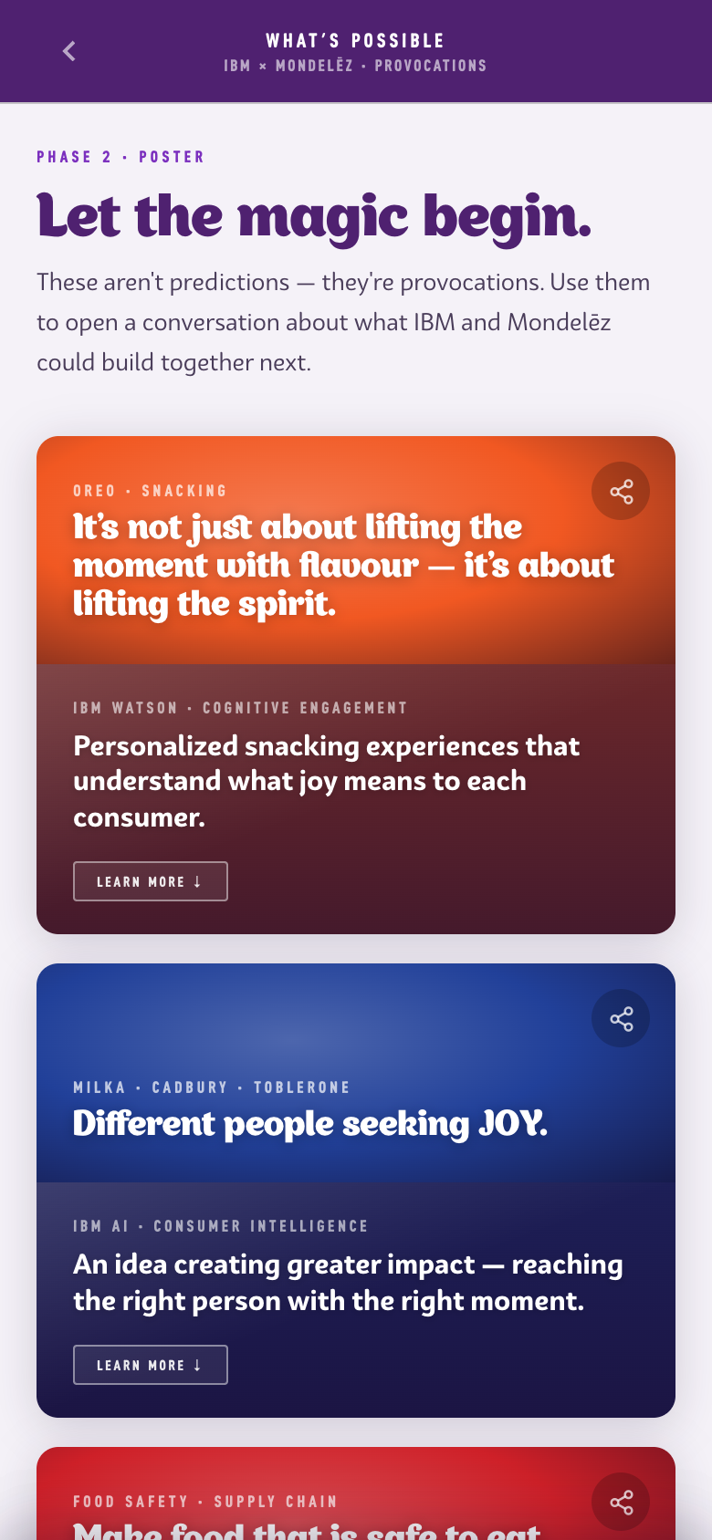
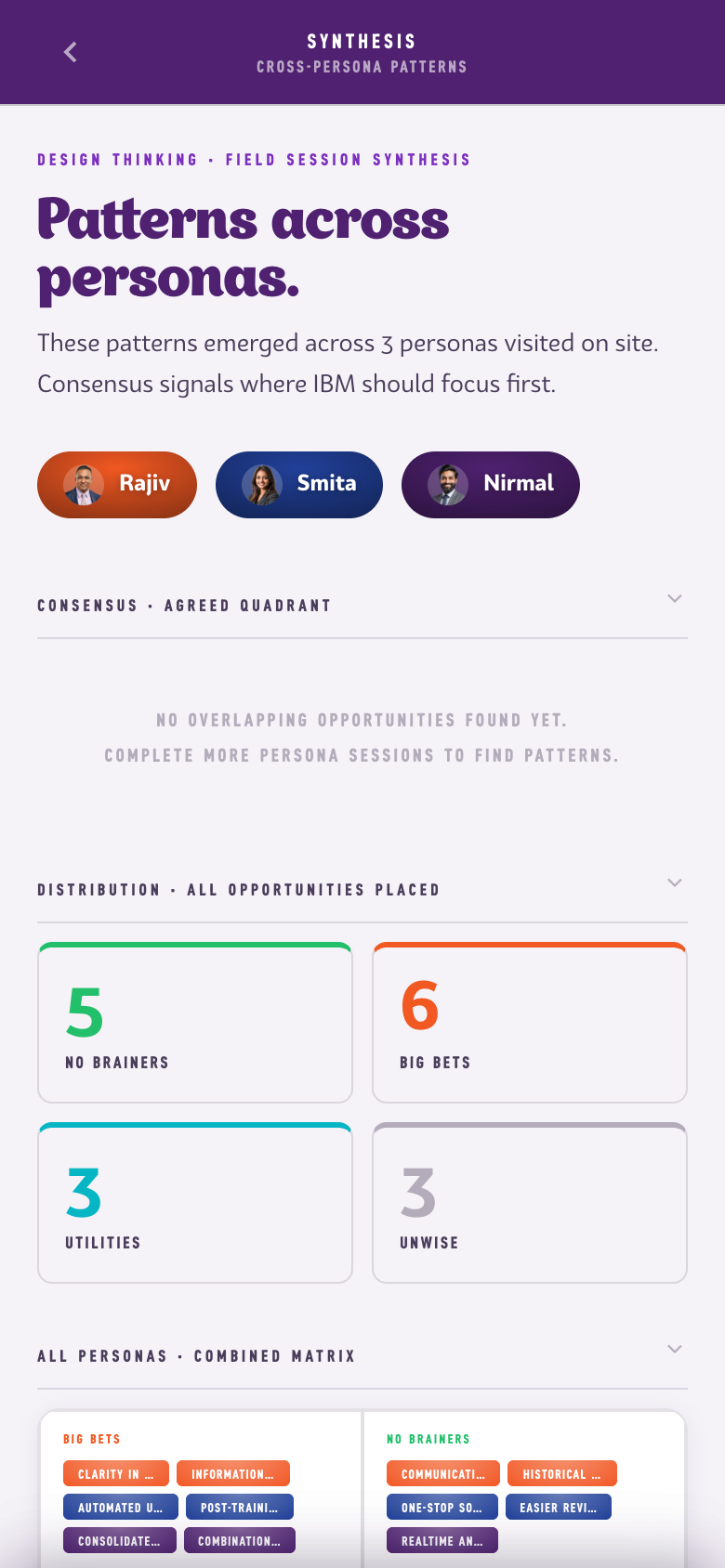
The source was a dense 23-page workbook. It contained three personas, thirteen journey stages, forty-two empathy quotes, the seven-product framework, and four AI-era provocations. Claude helped turn the PDF into a structured outline, proposed initial screen connections, and scaffolded a first pass. I set the architecture, wrote the interface copy, and tuned the interaction and motion system.
The result carries more than 320 source data points into 23 screens. The prototype reworks the delivery, not the evidence: the practitioners, quotes, and journey material stay grounded in the 2019 workbook, and the digital layer only changes how a facilitator moves through them. The AI suggestion sequence took three iterations: when the first version arrived too abruptly, I rebuilt it as a staggered series so each recommendation could be read before the next one landed.
Claude structured the source.
I made the product decisions.